Software Review
Flickit Pro 2.0

Function: Access a Flickr.com account from iPhone OS.
Developer: Green Volcano Software
Price: $4
Requirements: iPhone OS 3.1; WiFi, 3G, or EDGE network connection; valid Flickr.com account.
Trial: Feature-limited (basic upload-only version)
Flickit Pro is an application for iPhone and iPod touch that offers on-the-go access to your Flickr.com account. Besides the ability to upload new images to your account, you can browse past images in your photostream and from your friends, family, and other contacts; explore Flickr’s photos by interestingness, proximity, and groups to which you belong; and peruse recent activity (comments, favorites, etc.) on your content.

Browsing a photostream in Flickit Pro. The mode visible in this screenshot shows basic thumbnails. This screen also provides access to the account’s sets, tags, and favorite photos.
If you’ve been an ATPM reader for a while, you may remember my October 2008 review of the Mobile Fotos application for Flickr interaction. I must admit that Mobile Fotos served as a benchmark against which I compared Flickit Pro, yet I exclusively used Flickit Pro for a month in order to become accustomed to using it as my only mobile access to Flickr.
Good Marks for User Interface
On the whole, I am pleased with the intuitive user interface. Browsing Flickr photostreams, searching, and uploading new pictures all work well. A nice touch is that Flickit Pro automatically loads more thumbnails when the bottom of a screen is reached by scrolling. In other applications, including Mobile Fotos, some sort of Next button must be tapped to see more photos.
I particularly was impressed with the uploader, which allows predefinition of metadata such as keyword tags and whether or not to post new photos to your Twitter account, though all can, of course, be overridden for each new photo. I was also very happy about being able to edit the metadata in any of a batch of queued photos before they are uploaded—something that is not possible in the Mobile Fotos application.
It should be noted that if uploading to Flickr is your only desired task, Green Volcano Software also offers a free, uploader-only application that offers the same functionality for uploading as Flickit Pro, minus the ability to tweet new uploads.
Browsing Photos: the Good, the Bad, and the Odd
When viewing individual photos, there are three modes from which to choose. One of the modes simply displays the selected photo at full screen size. Swiping left and right or using the arrow buttons will advance through the photos in this mode.
A second view mode that is apparently unique to Flickit Pro is called Photoflow. In this mode, photos are presented in stacked succession and viewed in a manner similar to browsing windows in Apple’s Time Machine. You can either manually drag through the photos or enable auto-advance, which moves forward and backward through the photos simply by tilting the iPhone or iPod touch.

The Photoflow feature offers a unique, albeit gimmicky, way to browse a photostream.
This view mode is only going to please some people. Personally, I found it to be somewhat gimmicky and not extremely useful.
The third viewing mode displays the title, description, tags, comments, etc. for a photo. This mode is generally most useful to me; however, I found it to be sorely lacking. Even though the developer touts a mobile-optimized engine for Flickr, retrieving metadata seemed to take a smidgen longer than the Mobile Fotos application and doesn’t even offer as much information, such as the geolocation map and dates when the image was captured and uploaded. In fact, I didn’t find the engine particularly faster anywhere throughout the application than Mobile Fotos.

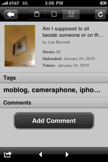
Viewing photo details with truncated title.
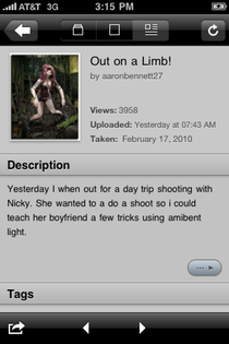
Particularly concerning is that if there are more than 7–8 words in the title or more than 2–3 keyword tags, the remainder is truncated with no means that I could find to view the rest. The description field, however, enables a small button to access a page with the rest of the description, if any. It seems to be a silly oversight to include a means to view the rest of a truncated description but not a truncated title or set of keyword tags.

A small button provides access to the rest of a long description, but no such button exists for truncated titles or keyword tags.
Also of concern was an interface glitch that occurred just as I began writing this review: the title shifted to the left edge of the screen with the thumbnail photo overlapping. Several relaunches of the application didn’t resolve it, however the text did eventually return to its proper position.

Interface glitch with a photo’s title.
There’s one additional bug that is present both in Flickit Pro and Mobile Fotos—neither application appears to honor the Taken timestamp. The Uploaded timestamp information is used instead.
Flickr Contacts
The interface for browsing accounts of my contacts, friends, and family seems somewhat clumsy. I’m accustomed to all my contacts being accessible at all times in Mobile Fotos. In Flickit Pro, however, contact visibility is optional.

Viewing available Flickr contacts. The blue dot indicates new photos from the respective contact.
Rather than directly accessing all your contacts, in Flickit Pro, you choose contacts to be displayed in the People screen. This behavior may work just fine if you know you only care to keep up with several specific people whenever you’re on the go. Some users, like me, may never know which of their contacts they want/need to peruse at any given time and prefer seeing a stream of thumbnail photos from all contacts in reverse chronological order, regardless of the photo’s owner.
While it’s easy to quickly add multiple accounts to the followed contacts list in the People screen, they can only be removed one at a time. Also, if the number being followed is large, it’s awkward to add more since you must first tap the Edit button at the top of the screen, then scroll all the way down past the last contact to access the Add New Contact option.
Another troublesome aspect of the followed contacts is that I find no single step to clear all the blue dot indicators for new photos from contacts. A user shouldn’t be required to tap each individual’s name and wait several seconds while the page of latest thumbnails loads in order to clear the notifications. There needs to be a Clear All Notifications function on the People screen.
Recent Activity
While it’s true I do not get much activity on my Flickr photostream, I can imagine there are people who do get a lot of activity and might like to be able to check on comments, favorites, etc. rather frequently.

No refresh for you!
Maybe it’s a limitation with Flickr’s API and there’s no way around it, but surely something is better than a jarring note that activity refreshing can only be done once per hour.
The Uploader
The interface for uploading photos is, in my opinion, the strongest feature of Flickit Pro, albeit not without its own quirks.

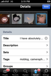
Uploading pictures to Flickr.
I very much like that metadata can be modified as often as necessary before a batch of queued photos is uploaded. Photos can also be selectively removed from a batch. This is far superior to Mobile Fotos, which offers no access to editing metadata after a photo has been added to the queue and only allows deleting the entire queue to start over—not individual photos out of the queue.
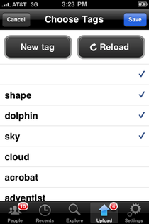
Managing keyword tags for uploads, however, isn’t nearly so thrilling as the rest of the upload process. In Flickit Pro, tags are selected from a list. If a tag isn’t available, there’s a button to add a new one.

Setting up keyword tags. Note the blank “null” tag at the top of the list—an interface bug that keeps the tag line visible if the Done button is tapped when no text was entered as a tag.
This behavior doesn’t cater well to accounts with dozens (or more) of pre-existing keyword tags. Regardless of whether the tag already exists, I can enter tags far more quickly if I can simply type them all out, as I do in Mobile Fotos, rather than scrolling through dozens of tags and selecting them individually.
Flickit Pro doesn’t even allow multiple tags to be added at the same time. If I type more than one word, it’s treated as one multi-word tag. To add several tags, the user must tap the New Tag button, type the tag, then tap Done—rinse and repeat all three steps for every new tag. And yet, I can even do this convoluted process faster than scrolling through existing tags and selecting them for the photo.
Almost as if adding insult to injury, the iPhone OS–native autocorrect is not enabled in the tag entry field. I have uploaded an improperly spelled tag on more than one occasion directly because of this omission.
Tweeting Uploads
A rather glaring bug in Flickit Pro’s uploader interface involves the feature for posting a message to a Twitter account when a photo is uploaded. After I added my own Twitter account, it became quickly apparent that there was no way to modify or remove my account. Although I can choose to not post a tweet for any or all photos in a batch upload, until this bug is fixed, I am stuck with only being able to tweet uploads to my personal Twitter account. There is also no method for tweeting a photo that has already been uploaded. The only point at which a photo can be tweeted is at the time of upload.
Currently, the only positive thing about the Twitter interaction is that the tweets are posted from the Flickit Pro application itself and requires only a single tap to choose whether or not to post a tweet.
Although Mobile Fotos has to switch to a desired Twitter application or the Web page to tweet photos, it is possible to tweet photos that are already uploaded, and you retain the ability to tweet from any desired Twitter account, assuming the Twitter application you use supports multiple accounts.
Defining an Innovation
The developer’s product Web page for Flickit Pro lists six “innovations you won’t find in any other Flickr iPhone app.” While it’s likely true that some of the innovations listed are unique to Flickit Pro, such as Photoflow and Infinite Scroll, I have trouble believing the rest are fully unique innovations:
Mobile-Optimized Flickr Engine
I’ve already mentioned that I don’t find Flickit Pro to be operationally faster than Mobile Fotos.
Favorite Contacts
Flickit Pro may indeed be the only iPhone application to manage a subset of Flickr contacts independently within the application. However, without the option to bypass favorites and directly access all contacts, this “innovation” may be pointless to some users.
Lack of Multiple Accounts
Perhaps a dealbreaker for many people is that Flickit Pro will only manage one Flickr account at a time. Although you can log out and back in with a different account, Mobile Fotos wins this round with its ability to store login information for multiple accounts and quickly switch between them.
Reader Comments (0)
Add A Comment