The Personal Computing Paradigm
Outliners
Back From The Dead
Back in January, I wrote about the sorry state of competition in today’s software market. Great products like DiskDoubler and MacWrite Pro were discontinued long ago, but still retain loyal followings. What’s most sad is that many new computer owners will never experience the simple, thoughtful Macintosh software created in the late ’80s and early ’90s.
With that in mind, I’m pleased to report that in the last few weeks several “classic” programs have been freed by their owners. Anyone can download and use them—with no warranties provided by the companies, of course. Among these are VisiCalc, the first spreadsheet and the personal computer’s first “killer app”; Corel WordPerfect 3.5, which is no longer under development because of its ancient codebase; and three outliners: Acta, ThinkTank, and MORE.
I’ve long lamented that I had heard so many great things about MORE, but never had a chance to try it. Thanks to an ATPM reader, I did get that chance. Thanks to the generosity of Symantec, you will too. You may find, as I have, that this relic is one of the best Macintosh writing tools available.
Outlines
In school I was taught that the first step in writing a paper was to outline the overall structure. The sections are I, II, III, etc. Within each of those are key facts i, ii, iii, etc. It was easy to reorganize a paper in outline form, and once you got the outline right, the paper practically wrote itself. The only problem is that a lot of people don’t think in outlines from the very beginning. They write best by “brain dumping” everything onto a page or computer screen. The first draft is a tangled mess, which is then massaged into a coherent piece of writing. For these people, paper outlines are a frustrating waste of time, but computer outlines are invaluable.
Probably the most common example of computer outlines is the Finder list view in Mac OS 7 and later. (It’s also found in Microsoft Windows’ Explorer application, since the Windows Program Manager doesn’t have this functionality built-in.) Outliners in AppleWorks and Microsoft Word work much the same way. The basic idea is that indentation level and vertical position exhibit structure. Each paragraph is assigned a level, and moving a paragraph while in outline view (optionally) drags all its subparagraphs along with it. You can show or suppress different levels of detail by changing which levels of paragraphs are displayed.
MORE Thoughtful Features
The outliners in AppleWorks and Word provide options for formatting outlines. You can choose label styles (e.g. Bullet, Harvard, Numeric, Legal), and there are commands for moving paragraphs and changing their levels. But MORE 3.1 goes much further.
- It makes it easy to rearrange paragraphs using either the keyboard, menus, or drag-and-drop. You can change a paragraph’s level simply by typing tab or shift-tab no matter where the insertion point is!
- Each paragraph can have comments associated with it, and the comments can be hidden independently from the paragraph.
- In addition to letting you expand or collapse paragraphs, you can “fold” them. Folding hides all but the first line and lets you examine the structure of your document, while still giving you an idea of where each paragraph fits in.
- Paragraphs can be “cloned,” which is like making a linked copy. Change one paragraph, and all its clones update. This is great if you use MORE for categorizing facts or ideas and aren’t sure where to put a particular paragraph. Just put it in two places and decide later.
- “Hoist” hides every paragraph but the current one (and its children). It’s yet another way MORE lets you temporarily suppress irrelevant parts of your document. Multiple hoists are also supported.
- MORE has a nice find feature that supports pattern-based searching. You can have it mark all the found occurrences and browse through them. Better still, you can use the “gather” feature to collect all the marked paragraphs (or clones of them) under the current paragraph.
A Writing Environment
MORE shines at organizing information and writing early drafts. Nearly everything in MORE is geared toward writing, as opposed to page layout. Most of the reorganization features can be controlled entirely from the keyboard. Although you can set left and right margins as with word processors, MORE has an option for wrapping paragraphs at the edge of the window. Resize the window and the text re-flows. It doesn’t take up valuable screen space showing margins or page breaks. This non-WYSIWYG approach is very comfortable for writing and jotting ideas.
Nevertheless, MORE includes enough formatting power to handle most types of documents. It has paragraph level style sheets (more on them later) and supports paragraph and character formatting at about the sophistication of AppleWorks.
Structure From Outlines
In past columns, I’ve talked a lot about style sheets. Next month I’m planning to write about cascading style sheets, which are currently a buzzword with Web developers. Although cascading style sheets are relatively new to the Web, MORE has had something similar long before there was a Web.
Each level of paragraph can have associated style attributes such as font, indentation, and line spacing. MORE applies these styles automatically to all paragraphs of those levels. This enforces the use of style sheets since everything must have a style, but you never have to worry which style to use for a paragraph because it’s handled automatically according to level.

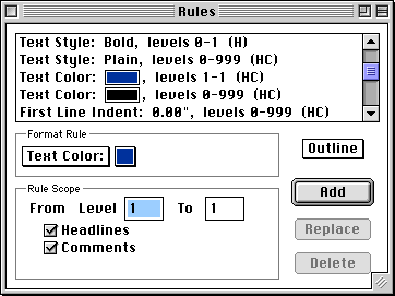
The cascading power comes from the Rules window. As you can see, you can define styles that act on ranges of levels. For instance, all paragraphs (levels 0–999) are colored black, but I’ve created an override for level 1 paragraphs, which appear in ATPM blue. Similarly, all levels are in plain text, but levels 0 and 1 override that with bold. You can override as many different attributes as you want, for any (consecutive) range of levels. Whatever attributes aren’t specified as overrides are inherited from other levels. Thus, you can easily make global changes such as switching between screen and printer fonts, without losing the ability to customize each and every level.
Paragraphs at a particular level are not required to have identical formatting. You can override style sheets on a sub-outline basis, as well as apply normal word processing format overrides.
MORE Than Outlines
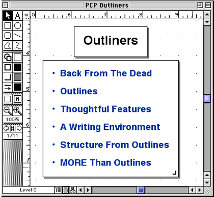
MORE gets its name because it’s more than an outliner. With today’s software one might be skeptical hearing that. After all, “more” features can translate to application bloat, ease-of-use problems and lack of focus. With MORE, the “more” is what makes it special. You see, MORE interprets the structure of your documents from the outline levels. It uses that information automatically to create tree charts and slide shows. No matter whether you work in outline, tree chart, or slide show (bullet chart) mode, the content remains the same. MORE controls all the formatting, and you can customize it if necessary.

What does this mean? Well, outlines are much easier to write with than slide shows. (Ever tried to write a presentation in a presentation program?) Tree charts show the big picture. Slide shows are good for presenting your ideas during a presentation, but if you need to distribute notes afterwards, outlines are better for printing. (You could also limit your slide show to levels 1 through 3, but include levels 1 through 5 in the outline printout if you want more details.)
A Place For Outliners
No word processor can be everything to everyone—from a composition environment, to a word processing environment, to a page layout environment. Maybe if you want to settle for the lowest common denominator in each category, you can use Microsoft Word each step of the way. Or, you can pick specialized tools for each stage of production. I use MORE for writing, Nisus Writer for word processing, and FrameMaker for layout and publishing.
Conclusion
Although it’s sad that a great product like MORE was discontinued, I’m grateful to Symantec for re-releasing it to the public for free. Although I think the original intent was to provide a sort of museum piece to show people what early ’90s Mac software was like, Symantec actually re-released an incredibly useful tool.
That’s not to say that MORE is perfect—far from it. While powerful, the rules interface is cumbersome, and the program doesn’t really feel like a normal Mac application. For example, page up and page down change the location of the insertion point (as in Windows), the arrow-key navigation is Apple II–style, and when working in MORE I always feel like I am stuck in a mode. There are no modern niceties like drag-and-drop between applications and PowerPC native code. However, it’s very fast, runs in less than 1.5 MB of RAM, adds nothing to my system folder, and takes up only 3.5 MB of disk space—including libraries, clip art, templates and tutorial files.
MORE has become my tool of choice for writing first drafts and organizing notes. For simple (but not necessarily short) documents, I need no additional tools. For longer ones, I find it necessary to add the formatting, tables, and graphics with FrameMaker. But for writing and organizing ideas, nothing beats a real outliner. MORE is definitely one.
Also in This Series
- How Cool Is Your Mac? · May 2012
- Mac OS X’s Increasing Stability · August 2006
- Coping With Mac OS X’s Font Rendering · January 2006
- E-Mail Archiving with Eudora and Mail.app · January 2003
- Grab Bag · October 2002
- Mac OS X 10.2—First Impressions · September 2002
- Mac OS X 10.1—First Impressions · October 2001
- Mac OS X Tips · June 2001
- Mac OS X—Finally · May 2001
- Complete Archive
Reader Comments (0)
Add A Comment