About This Particular Outliner
Legacy Outliners
Most of us have such a focus on the Macs we now work with that it is almost impossible to imagine the state of affairs only 10–15 years ago. This was before the Web, folks. It was before Microsoft finally came out with a reasonable facsimile of the Mac.
This was when the personal computer was more of a privately sequestered personal assistant than a gateway to the rest of the world. Basically everyone who was clever in what we then called the “Free World” was a Mac user, and much of the software we used was clever as well. Innovations were rushing at us faster than we could follow.
Much of the idealistic promise of the sixties was transferred to the creative and revolutionary world of the Mac in the eighties and early nineties. Nowhere in that flow of applications was this more obvious than in outliners. They appeared first on the Mac and were stretched every way possible before our eyes. A breed of outliner products emerged in that period that was so superb that many still have an enthusiastic following today, long after their host companies have evaporated.
Consider also that this loyalty has been through some pretty significant hardships. All of these products—the really superb ones—were discontinued. Many of them stopped working well for a period between System 7 and Mac OS 8, but they all more or less now work under Classic, and many are free.
What’s amazing is how feature-rich these products are. They can do things that are not common and in some cases not available today. I’d be interested in hearing theories why this is the case; my guess is that market dynamics have changed. It used to be that we Mac users valued experimentation more—our very use of the Mac was part of a reinvention of self, and we were more adaptable and curious. Now we tend to have comparatively settled ideas about how a computer fits in our life. So there is a higher barrier to novelty than in the golden era. For example, just look at what is coming from open software and how hard those applications try to look like existing (often Microsoft) products.
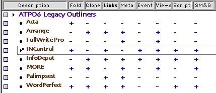
We’ll take a look at some of the great old outliners in this month’s column. As with all our columns, the idea is to help you design your own particular toolset, based on how you work. So we’ll focus on features and capabilities rather than history.
All of these outliners may have a few screen refresh and printing glitches when running under Classic. Import and export, where they exist, are limited to old formats. And help is not always complete because this was from an era where bound manuals were expected. Installation may be tricky for some if you are not booted in Mac OS 9.
If you’ve been following our column, you’ll recall that we’ve been providing background on Mac outliners. We started with some history, then described features in one, then another column. Then we got into use patterns and user interfaces.
We’ll refer to the usage patterns and feature descriptions in the process of describing these wonderful legacy outliners.
Acta
Acta is one of the oldest, and is in a sense the purest outliner on the Mac. Its appeal is in the straightforward implementation of the paradigm.
Working with Acta is like visiting Florence because so many innovations appeared here. This, folks, is where “smart quotes” first appeared anywhere—not the curly characters themselves, but the technique of correctly curling them when the ordinary quote key is used.
Acta also implemented the “flippy triangle,” as we described in last month’s column. This was a very big deal, fellow outliners, and is still one of the key elements that makes a Mac a Mac.
The paradigm is simple: there is only one sort of entity, the header (which Acta calls a “topic”); there is no separate entity for notes or paragraphs. The font control is rudimentary with no named styles. Similarly, keyboard navigation is strong but not unusual. Acta also has comparatively strong sort capabilities, sorting numerically or alphabetically among “sisters” or “daughters.”
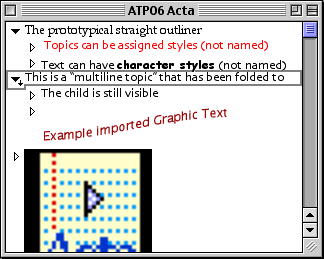
Acta is one of the few outliners that folds headers to a single line (they call it “shrinking). It has an excellent sound recording capability. Otherwise, the outlining basics are here and little else. Last month we addressed user interface details. Note how the screenshot denotes the header that has folded text with the little downward pointing arrow.
Acta
What makes Acta interesting is that it leverages the fact that topics are all the same beast. It is one of the few Mac outliners that handles graphics gracefully and without restrictions—a graphic can be placed anywhere as a topic. It is the feature that keeps this on the list of interesting legacy outliners. In fact, the existence of this feature embarrasses just about everyone else as many of them (like OmniOutliner) don’t handle graphics at all, and those that do handle them only within notes, seldom within headers.
You could even rig up a text-to-graphic AppleScript and paste graphic text as topics as the screenshot shows.
The Feature Score-card
Acta has: prototypical collapsing and re-arranging; AppleScriptability to some extent; folding of multiline headers; sort; and most especially support for graphics and speech.
Acta doesn’t have: a separate class of “note” object; any sort of meta-outline; integration with the Finder; named styles; alternative views; snippet input; external links; internal scripts or events; search, mark, and gather; hoist; columns; standard export; tagging; keywords; indexing; or header notation.
Availability
David Dunham has kindly offered Acta for free (with no support).
Arrange
As we go through this little survey, you’ll probably relate the different applications to those you know well: InfoDepot is like FileMaker but with outlining; INControl is similar to Now Up-To-Date plus OmniOutliner; WordPerfect compares to Word plus MORE, and so on. Arrange is unlike anything you know. In some ways it is similar to Tinderbox or some elements of NoteBook; DEVONthink may eventually develop into something like this, but for now Arrange is different from anything else on the Mac.
It was developed by Common Knowledge, Inc. In the early 90s, Arrange sold for about $500. Then in the middle of the decade—just when the Web appeared—it was revamped as WebArranger, and transferred to CE Software’s product managers. They began by making it a free download, then sold it at $40.
It is basically a database—the first instance of a PIM based on an object-oriented database—that allows you to create data fields and relationships on the fly. Everything is geared to support advanced outlining, but you have table and calendar views as well. Every trick in the book is pulled to create outliner power in the rows: entity types and instances, links, clones, and recursion. It suffers from a couple problems: there is a learning curve because it is so novel, and it has a simplistic-appearing interface by today’s standards because of the old 8-bit small icons the Mac used to use. Don’t let that deter you, because just exploring how they put this together will make you more capable in thinking about outlines.
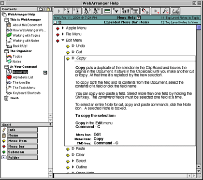
The general layout is shown in the screenshot. It has one of the most detailed and handy outliner user interfaces I have seen—and as you know, I’ve seen a lot. The panel on the left is an outline of notes. This is an outliner like most, except you can assign custom icons. The items in this outline are called “topics.”
Arrange Outlines of Outlines
The pane on the right opens a topic, and it consists of an outline as well! Elements of this outline are called notes. Superficially, it is like NoteBook and NoteTaker, which also support outlines of outlines. Ah, but these notes aren’t plain vanilla cells that you dump text and media into. These are data elements. They have types, like “appointment,” “person,” “company,” and so on.
Each type has fields. For instance, an appointment type would likely have a “Person” who you had the appointment with. But there would also be a “Person” type that has its own fields, for instance “Company.” And in turn, you may have a “Company” type. Perhaps you can see where this is going.
How it works is neat. Usually, the outline defines the relationship, and you can do that here manually as you do in ordinary outliners. But in Arrange, the fields in a topic can “grow” the outline. So you could set up an outline template that outlined appointments by date and have people then companies under. But you could define another view that showed all interactions by company, with subheads of date, then person met.
Arrange comes with certain types built in, all the expected stuff: contacts, dates, URLs, currency, and text notes, of course. There are lots more, and some of these have special abilities: dates can sound alarms, URLs can launch and store pages, phone numbers can auto-dial, and so on. But you can define anything you wish in terms of note types and fields. Arrange even contains a robust plug-in software development kit (SDK) that effectively turns it into a development platform. For example, CE software used it to add Netscape bookmark import and mail linkage plug-ins when rebranding it as WebArranger.
Arrange failed to gain traction because what makes it so powerful is hard to simply explain. But I’ll try by focusing on the one thing that might make you want to seek it out above all other options anywhere.
Each item in the outline on the right is called a note. Casual users would use notes that have simple fields, for instance a note type of “former high school teachers” with fields of “name” (being a simple text field) and a rating (being a pop-up of great, average, and so on).
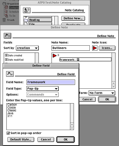
As we’ve already noted (oops, sorry for the pun), you can base a field on a note type. This means that if you wish, you can extend the tree structure of outlines into a more dense structure. The compound screenshot shows several windows stacked on top of one another. (We had to shrink it.)
Arrange Note and Field Definition
You’ve already seen the window furthest in the back. That’s the window with the outline of outlines on the left and the outline of notes on the right. Instead of using an existing note type (like text, event, contact, or URL), we’ll define a new one. So we open the “Note Catalog” window and hit the “Define New…” button that you can see. That opens the “Define Note” window. On the right, it has a place to name the note type, which we’ve called “Item A” for this example and assigned a face icon.
The list on the left is all the predefined and supplied field types. You can see that it contains things like “Date Created,” “Date Modified” and so on. If you were defining a sales contact note type, you might want to have these fields. We already chose one field, “Item B,” to be a simple text field.
We then clicked the button in the lower left to create a new field, “Item C.” This brings up the frontmost window, “Define Field.” Once again, we could have selected an existing Field Type (text, pop-up, number, and so on) but in this case we selected a “Note Link,” and chose Item A, to match on the text field.
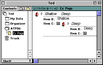
This is pretty powerful stuff. The result of this recursive inheritance looks like the next screenshot.
Arrange Note Display
See that I have a note that references a note? The master note is shallow, the embedded note is deep. The next screenshot shows some populated names not nested, just listed. Note how you can set the fields so that they display as columns when not expanded.
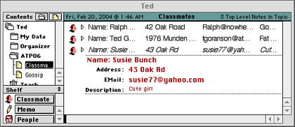
Arrange Classmates
These two notions together: inherited object-oriented data elements and outline views really add up to some heavy power. For example, I might make an outline of who met whom in what location. Each time I enter a name, it can be keyed to display their office address. I can later sort and build an outline of locations and their utilization.
This is why you might consider this as your particular outliner. This feature set is not particularly intuitive, but it makes it truly unique and powerful for some applications.
The Feature Score-card
Arrange has: service-like snipping through the “Grabber” extension (which doesn’t work in Classic); outlines of outlines; header relationships which use iconic metaphors; something that serves as cloning; effective import/export in terms of delimiter options; a novel type of folding (not quite complete); a rudimentary hoist; tailorable outline views via “filters;” relationships that serve as a sort of internal link; events; (very nice) topic and field-specific styles; and most strikingly the object database that can populate your outline.
Arrange doesn’t have: columns; graphical layouts; integrated multilevels; support for multimedia (other than PICTs); or internal/external scripting.
Availability
Printing in Classic is broken and on some systems (we think large HFS+ disks) you’ll have to create a small disk image to save your outlines in.
We were unable to find a source to download this, but we’ll keep trying. The last incarnation was a free giveaway (supposedly for a limited time) by CE Software, so possibly someone may make that version available as a download. Amazingly, I found apparently boxed retail copies for sale for $5 (plus an equal amount for shipping) at Software Outlet. To test the company, I purchased a product via Web and got it.
FullWrite Pro
FullWrite Pro is unique among the products discussed here. It was a remarkably advanced word processor in its day, one that included an outliner.
FullWrite entered service some time before 1988 on the Mac from Ashton-Tate, but when they were sold to Borland, it disappeared for a while. Then it got spun out to Akimbo who improved it and later repurposed some of the code in a Web tool called Globetrotter. That Web authoring tool failed to get traction, and Akimbo went under in 1997. FullWrite was made free in 1998.
FullWrite was the first word processor to have a self-completing keyword glossary. It has “walk down” menus that support navigation and selection from the keyboard and lots of cool word processing features, but that’s not why we are here.
Because the outliner is part of the word processor (as with WordPerfect below), it supports named styles. No OS X outliner today does excepting Word. But Word’s implementation of styles is convoluted and annoying. FullWrite’s is elegant in comparison, with the styles cascading in the manner we now use in Web design.
Here’s what makes FullWrite’s outliner unique: in all current Mac outliners, the outline headers are an intrinsic part of the document. As the outline gets “filled out” the headers become chapter and section titles. That means that you cannot put notes to yourself in the headers, or if you do you need to clean things up at the end.
FullWrite’s outliner is an overlay on the emerging document. You can see the outliner by itself without the document text. Or you can see the document without the outline headers. The intended way of working with outlines is to dump all sorts of unformed ideas into them that are intended to be in the document, but also dump all sorts of meta-comments and notes to self about the document. As the document matures, these meta-comments may even grow.
Then, at last, you can just turn the outline into invisible text, or alternatively remove the outline controls and indents and keep the headers. Our feature list described something like this capability in terms of outlines about outlines and such. FullWrite takes this simpler and more direct approach to annotation. The idea is extended by a cool way of inserting “notes” anywhere.
The screenshot shows an outline with a couple lines of document text. The first non-bold line is a document paragraph, while the bold lines are outline headers. I used this form so you could compare it to last month’s column on user interface strategies.
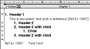
FullWrite Outline
Now we can change the display on the left so that it shows the notes icons. One “post-it” note is expanded, and you can now see that the other note is a bibliographic marker whose text appears at the bottom of the document in the references section.
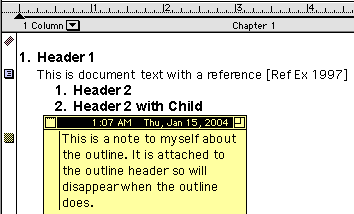
FullWrite Notes
There is a separate pane you can open that displays the outline only. In either view (outline or document), you can re-arrange the outline in the usual ways.
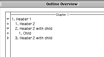
FullWrite Outline View
Our final screenshot shows the very brief example document with the outline removed. Once it is removed, it is gone forever.
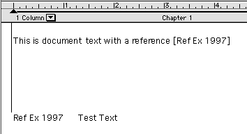
FullWrite Outline Gone
You can save your document (with or without outline) as a MacWrite file, which the MacLinkPlus translators used to be able to massage into nearly any word processor. We have reports that DataViz changed the recent set of translators, creating problems, so if you try this, use an older version. Alternatively you can export directly to InfoDepot, another extraordinary outliner that we will discuss below.
The Feature Score-card
FullWrite Pro has: reasonably handy outline manipulation; named styles; strong editing tools including notes, tables, and index tagging; full media support; export to word processors; and, most interestingly, meta-comment capable outline headers, with views that exclude the document or the outline.
FullWrite Pro doesn’t have: folding; hoist; metaphors, scriptability of any kind; snippet input; internal or external links (excepting the prefab references, endnotes, and footnotes links); mark and gather; clones; events; columns (in the outline); or advanced header relationships.
Availability
Available free—with no support—from Dave Trautman.
INControl
Oddly, though I know that MORE has the staunchest user community, my mail has been an order of magnitude greater in favor of INControl and InfoDepot.
INControl (that combination of caps is the most common) was developed and marketed by Attain; like so many other outliners it suffered during the period of the great extinction and went under. As with all we discuss here, it appears to work well enough in Classic.
The design strategy for this application was to excel at task and event management using outlines. Toward that end, the developers employed an outliner with columns much like OmniOutliner’s and InfoDepot’s. Three columns were built-in: start date, finish date, and priority. Filling in those turned that row into an event data element. The screenshot shows several rows with one event.
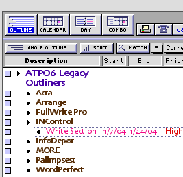
INControl Event
Events are special citizens in INControl; they appear in different ways in all sorts of different views. You can view several different types of calendar view and see those items as you would in iCal or Now Up-To-Date. The views are: outline, table (where all rows are at the same level of indention—nice for sorting), monthly calendar, and daily schedule. Any of these could be displayed in combination with the others in the same window.
The screenshot shows the same event in a calendar window. The ways these views integrated for events was notable: no one seems to have done it as well for calendars. Calendars can be published and shared over networks. This one was captured on the 22nd of January.
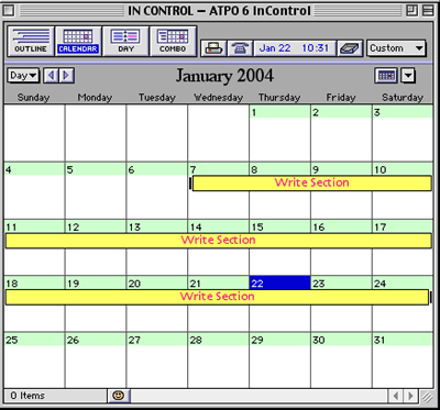
INControl Calendar
Quite apart from the event type, the columns can be used in much the same way that OmniOutliner’s are today, with pop-ups and data types and sorting and such. But it had a feature I don’t think anyone has: you can set a shortcut to go to a database (several PIMs plus FileMaker Pro) and automatically enter a data item in an INControl cell—or alternatively launch the database and display a record. Notice in the screenshot how we were able to have the parent header span across the columns; now that’s nice.
In the screenshot, that little square to the upper right of the flippy arrow on the INControl row indicates a link to a file. The columns are cool, especially when mixed with the event types and some pretty complete search and mark features. But it is the extraordinary handling of events and calendar displays that would prompt you to look at it today. You can get columns by themselves in OmniOutliner and even better ones in InfoDepot.
Oh, one more thing. See that button in the first screenshot with the purple that says “Match?” How this works is simple and amazingly powerful. You put your cursor in a cell and Match will narrow the outline to just the elements that match, but including all their parents. Suppose you were a professional writer and you had a column that indicated whether a section of paragraph was finished or not. You could match on “unfinished” and see all the work you had to do in the context of the structure of the book. Or if you had many distributed storylines like Tom Clancy, you could just show one to check for continuity.
The Feature Score-card
INControl has: folding; definable styles by rows and columns; several novel views (outline, table, several calendars, to-do list); metaphors in the form of calendars and day planners; links in the form of file aliases and URLs; assignable styles by rows and columns; rather competent internal macros that affect sort and view; columns; some mark and sort (but not quite “gather”); the ability to hide and show columns in saved or scripted custom views; and most supremely, both outline rows as events that are elegantly integrated into non-outlining views and the powerful “match.”
INControl doesn’t have: AppleScript (except for the way-cool data lookup, which is implemented by AppleScript); hoist; any standard export; support for multimedia; any meta or multi-levels; snipping (except for URLs/bookmarks); header relationships, or even label/bullet control.
Availability
We’ve been unable to locate someone who can make this available. If anyone has a lead, we’ll send an ATPO ambassador out armed with doughnuts.
InfoDepot
The story of InfoDepot is surely one of the saddest in this column. It started life as Fair Witness. This was in the days when the layout tools of FileMaker were really making people pay attention. Fair Witness was as strong a database as FileMaker but with heavy emphasis on collecting disparate information, then organizing it by most of the paradigms we noted in ATPO number one: spreadsheet, database, graphical layouts, and of course outlining. Fair Witness was targeted at lawyers for building their cases and arguments.
As the outlining features grew, it took on a whole new identity as InfoDepot and became the very best of a certain class of outliners, the class that’s today represented by OmniOutliner: multifunction repositories. Its developers, Chena, sold it to West Publishing, a electronic publisher of case law used in building legal arguments (and competitor to Lexis) who were going to make a Windows version. A 3.0 beta was distributed. But West was in turn acquired by a much larger firm who shelved it. When it was shelved, the beta had support for collaborative outlining over a network.
InfoDepot 2.5, the latest, still runs under Classic if you can acquire a copy. It ships with a large, comprehensive manual as an InfoDepot document. It continues to amaze me how few OS X outliners do this; if their product is good enough, where better to use it than in its own documentation?
The screenshot shows one page of the help document. That window displays a row and its column cells shown in a “form” view, precisely identical to what you would see as a record layout in FileMaker. (The outline header is the text in pink, the column headers are the bold black text, and the text in boxes is from the column cells.) The only difference is that when you see all the records in InfoDepot, they are in an outline. Oh, how I wish FileMaker had this!
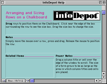
InfoDepot Help
At root it is a single-pane outliner similar to Acta, with no separate category of notes or paragraph text. As a straight outliner, it is pretty good, supporting a number of style and printing options still notable today.
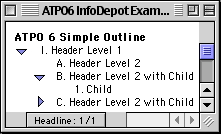
InfoDepot Outline
To that, it adds columns like INControl’s that can be hidden, even password protected. Many calculations, sorts, and layout features are supported in these column cells. A cell can contain all the normal text numbers, dates and such, plus graphics, movies, and sound. This part is much like OmniOutliner except with style/layout control, password protection, scriptable drop, and multimedia support.
In this edition of ATPO, we only focus on features that are unusual compared to OS X outliners. Here are some that will blow holes in your booties.
The screenshot shows some columns added to our outline, plus some cell formatting. InfoDepot makes heavy use of “badges,” those little grey icons in the cells. The one in the “Child” cell (which looks like an old ADB connector) is a link to another outline, but could have been any document. Clicking the badge launches the application and opens the document. In my usage of InfoDepot, I nested outlines this way, the “outlines of outlines” feature we’ve mentioned. Other badges exist for speech, AppleScripts, “crop” (a cell can be partially displayed) and mark.
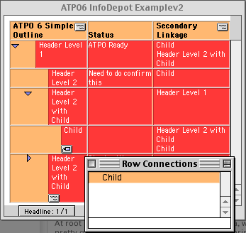
InfoDepot Row Links
The first column is a simple text column where we have made notes on sections. That could be hidden in the “writing” template and shown in the “editing” or “administration” ones. But look at the second column. That badge at the top of the column is a pop-up that shows all the rows of the same outline. Selecting one enters that row into the selected cell. This is a novel way of linking rows that I have seen nowhere else.
But it gets cooler. See the same badge in the outline column, the one that’s labeled “ATPO6 Simple Outline?” It allows something similar but oh-so-powerful. Placing the cursor in a row and selecting from the outline pop-up puts a badge in that row in the “outline column.” See one in the header of the lower left. Clicking that opens a window (shown on the lower right) that links to that row, here “Child.”
The power of this is not apparent until you realize that you can build templates that hide rows as well as cells. That means within the same outline you can have many other outlines, all hidden but interlinked with one another. If I clicked that “Child” window, I would get a hoisted view of that row. This is something special, fellow outliners.
And the whole thing is AppleScriptable, even to the point of attaching scripts to cells that can be triggered with a badge or any of several actions like drag row or add connection. (We’ll get to connections in a moment.)
But there’s more. The cells could be moved about as if they were fields in a database and presented in a “form view” that could be shifted about using layouts just as in FileMaker. Here we show a cell in a form we made that shows one of the hidden columns, in this case, text.
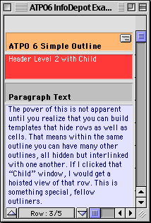
InfoDepot Form View
Finally there is a “chalkboard view,” not unlike Inspiration’s brainstorming view, but without the option for symbols instead of text rectangles (and other graphic niceties). Here is where you can make your connections.
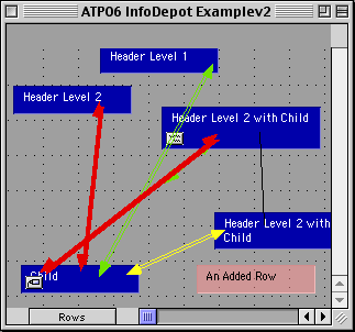
InfoDepot Chalkboard
Inspiration is one of the two legacy outliners that is still sold. It migrated to Mac/Windows and targets schoolchildren. Inspiration is not surveyed here because it continues to be developed and is a strong product. We’ll revisit it properly in a future column, but for now you can read an excellent ATPM review.
TakeNote! is the other one still sold. It is also dual-platform, but the Mac version runs only in Classic and it doesn’t seem to have been updated since 1996. It is likewise targeted at schools. Its paradigm is a bibliographic reference card metaphor. I could not find any limits on the Mac demo.
And on and on, InfoDepot has time lines, calendars, scrapbooks, glossaries, worksheets, layout templates, categories, sketchpads, drawing tools, support for multimedia/speech, and even more. Having all those features in one package is great; most of them you can find piecemeal in later applications and some even do them better.
What makes InfoDepot worth exploring for you is that it is still the very best column outliner in the world, on any platform. It is still the most scriptable, and it has those unique row-to-row and outline-in-outline relations.
The Feature Score-card
InfoDepot has: extremely good AppleScriptability, at the level of no current OS X outliner as it is scriptable, recordable, and attachable (this last means that the script effectively becomes a part of the application); columns (with high level of appearance tailorability) and flexibility; folding; export as MORE files (which some current outliners import); one of the best “hoist” features; events; and most uniquely of all, the FileMaker-like “form” views with a brainstorming “chalkboard” view.
InfoDepot doesn’t have: a separate outliner entity for paragraphs or annotations.
Availability
We know of no source, but as with Arrange and INControl, there are several hundred thousand installer floppies out there. Surely now with this column, there should be a market for used legal copies. I know that serious efforts have been made to purchase the source code. Rumors have it that the source code has actually been lost. Printing is broken.
MORE
Of all the legacy outliners we mention, MORE has the largest following. That may be in part because its primary developer, Dave Winer, is a tireless promoter. Dave has also boldly led a movement to make these abandoned outliners available at no cost, a noble gesture.
MORE is a one-and-a-half-pane outliner; notes exist in pop-up windows. It has very strong keyboard control, setting the undisputed standard that many modern outliners follow. Per-level styles (called “rules”) are supported, and it can handily “hoist” in useful ways.
MORE was a leader in several ways, including the display of tree and bullet views, rather mundane by today’s standards. But that bullet display contributed to its own undoing. Symantec bought MORE with the intent of turning it into a competitor to PowerPoint and the like. (Hard to recall: there really was competition in those days.) The cost of converting turned out to be too great when added to the (for that time) high acquisition price, so it was killed.
What makes MORE so interesting to a user today is its still impressive search, mark, and gather capabilities, combined with cloning. These are four independent features that have not been matched in this form by anyone else. Somewhat similar capabilities exist in the powerhouse outliners of today, like Tinderbox, NoteTaker, and NoteBook, but MORE’s implementation is simple and elegant.
“Cloning” makes a copy of a header that can be relocated elsewhere. It is much like a Finder alias, but predates them. Any number of headers can be manually marked, turning them red. The search command can find any header with a string and mark it. Or if the string is in a note (which MORE calls “comments”) its header is marked.
The screenshot shows some example headers. One of these (with the trailing “ddd”) is cloned. Three have been manually selected (indicated by the highlighting) and “marked” which turns them red. We could have marked by searching. (MORE’s search was powerful in its day but is poor by modern standards.) Last month, we highlighted some of MORE’s user interface gizmos, which are pretty impressive—so note the status message at the bottom of the window that is set to advise on the levels of hoisting. A nice touch.
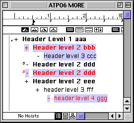
MORE’s Marked Headers
Gather is still an impressive experience: you have choices to clone, copy, or move the selected headers. You also have several choices as to how to gather them as shown. It takes a whole lot of adjustment to actually use this in how you think, and may require some tricks. But if it matches how your mind works, it is very impressive. (Modern outliners that gather tend to use keywords and attributes rather than relying solely on text.)
Here is the options dialog:
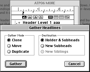
MORE’s Gather Options
And next the gathered headers using those options. Note that MORE flattens the results: a gathered header cannot have children. (Tinderbox follows this convention.) A little scriptability would have gone a long way here.
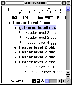
MORE’s Gathered Headers
If you want to use an outliner to write a complex document and all you want is basic outlining, some reasonable control over styles, plus the remarkable “gather”—and you don’t mind losing the features of OS X—you might not do much better than MORE.
The Feature Score-card
MORE has: hoisting; folding of multiline headers; cloning; header level (but not character) styles; alternative views in the form of rudimentary bullet slides and tree views; support for graphics in headers and comments; good keyboard control; annotations; strong print options; and most notably search, mark, and gather.
MORE does not have: any sort of internal or external scripting; (in its current state) reasonable export formats; any sort of meta-outlining, any Finder integration; hyperlinks; links; metaphors; columns; snipping input mechanism; events; tagging (other than “marking”); indexing; or header relationships.
Availability
Available free—with no support—from Userland.
Palimpsest
I’m guessing that few people ever heard of Palimpsest, one of the most interesting legacy outliners. It was created by Western Civilization (John Allsopp, of the highly regarded Style Master).
It was innovative in several ways, beginning with its development environment: Prograph, an advanced visual programming system that was Mac-only and very, very cool. Alas, Pictorius—the developer of Prograph—went under in the dark days of Apple, but you can get a feel for the system in this 1993 MacTech article. Note that Prograph structures are something called “dataflow trees,” structures very close to the outlining paradigm.
Palimpsest was designed for a very specific purpose: to take literature, “pour” it into outline form, and add comments, notations and even books about the books. All Palimpsest documents start with a book structure which is where the primary outlining comes in. These books are not intended to be re-organized once entered, so tools for flexibly shifting things around were less well developed.
What made it mind-bogglingly advanced was how it used hyperlinks. These were very much in the tradition that Tinderbox supports today: a link could be named, and have an attribute. They could be one- or two-way. Links of many types could overlap—in such a case if clicked an option pop-up would display the possible paths. Links could even be “half-way,” which Palimpsest calls annotations.
The screenshot shows the link attributes for one piece of text, “legacy outliners.” It has two links from it, both to the section “ATPO Pal Links” in the document “ATPO Example,” but to different destinations The window below those two destinations displays the complete text of the target selected from the list right above. Each link has several attributes: the user who made it, the date made or modified, and a user defined “label,” whose assignment pop-up you can see at the bottom.
A similar dialog exists for the other link types.
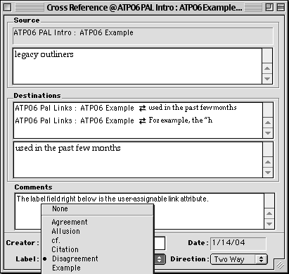
Palimpsest Link Types
A next frontier in outliners is how databases, advanced hypertext, and outlining can be combined. Tinderbox is the leader among current outliners in scope, but many of the outliner examples we’ve used in ATPO in the past few months explore this synthesis to some degree. Palimpsest had a few things really right, and some capabilities even Tinderbox is lacking.
For example, the “header” structure of the outline was implemented as a built-in type of link, coexisting with all the custom link types one may define. The link types also formed a sort of attribute, not unlike a database category.
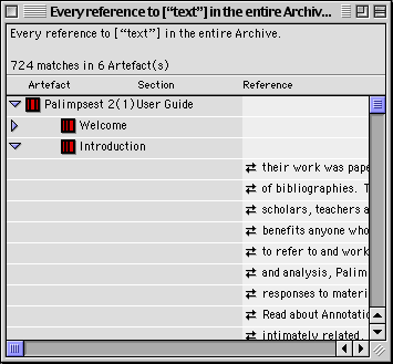
Palimpsest’s search capabilities are what remain extraordinary. You can combine search rules over both contents and link attributes. The report was implemented as a dynamic hypertext outline and is still the best I have ever seen. The screenshot truncates the lines of context.
What Pal has done is find every instance of the word “text” in the help document. Each line in the list on the right is a line which contains that word so you can see the context. The outline is the relationship of the sections in which those lines were found. Wouldn’t you like to have that today?
Palimpsest Search Results
There are several useful visualization tools to show maps of cross-references, even a “path” view, which showed a history of various link sequences.
When started, the application searches every file on your hard disk to build a dynamic library of Palimpsest documents (which could be interlinked). That made sense ten years ago, but means very large startup times now. A preference will just use the old index.
But there are other scalability problems. I believe I was the world’s heaviest user of Palimpsest, with hundreds of thousands of links. On those old Macs, these documents were really stressed. My biggest project was a complete gloss of Finnegans Wake with every annotation you could find and keyed to every geographic feature mentioned, including a map of Dublin. It took me years.
It was the first application I knew that allowed you to author a complex hypertext document and export painlessly to a complete Web site. I created a Beatles information site. You can see there how the different types of hyperlinks are “flattened” to HTML.
Like most of the applications discussed here, it broke somewhere around Mac OS 8, but now it seems to work fine in Classic. When it broke, Western Civilization abandoned it. Their business model was to have schools be their anchor customers, with students clicking and adding glosses to classic texts, writing and submitting their essays in Palimpsest format. But public domain etext didn’t take off like we all thought it would.
The help and tutorials (which still come with the download) were amazingly thorough and clear, except they invented a whole new lingo to describe what they were doing. This was unnecessary in most cases and really adds to the learning curve. But once inside, it is a beautiful experience.
The intended use pattern was to develop a coherent document based on an existing document. If this is close to what you do, check it out.
The Feature Score-card
Palimpsest has: reasonable outline manipulation tools; one of the best implementations of headers as distinct from paragraphs; fairly strong integration with the Finder outliner; something like “hoist”; some rather flexible layout view design tools, but these are not switchable on the fly; exports to simple HTML in a way that elegantly translates the complex links; support for images (but lots bog it down); and most especially the internal link mechanisms, which even rival Tinderbox’s in a few ways.
Palimpsest doesn’t have: named styles (though export to HTML can translate some applied styles to names); “outlines of outlines” or meta-outlines; folding independent of the headers; snipping input; capability of linking to external files; mark-and-gather; cloning; columns; events; tagging apart from the link type; indexing apart from the “search” feature; metaphors; or any sort of internal or external scripting.
Availability
The Palimpsest Web site is more or less still there, but is not linked from the active parts of the site. Western Civilization is not currently returning queries related to Palimpsest, even from registered users. But you can still download and explore the demo.
WordPerfect
What an amazing story! For many years, WordPerfect was the number two word processor on the Mac, superior in many ways to Word. WordPerfect was developed by Satellite Software of Orem Utah, which renamed itself WordPerfect Corp. They rewrote the DOS version for Unix and NeXT. This became the basis for both the Windows and Mac code base, but the Mac version advanced faster. WordPerfect was bought by Novell, and WordPerfect 3.5 for the Mac was released to much fanfare.
Then the whole product line was acquired by Corel who updated the application through 3.5.4 and readied an impressive version 4 that was never released. Along the way, all the various owners took nosedives after suffering severe defeats on the Windows side. We won’t go into the legends of evil here…in any case, support for the Mac was an early casualty. In an amazing act of grace, the program was made available as a free download by Corel as 3.5e (enhanced) in 1997. Through some unknown channel, a patch for later OS compatibility appeared.
WordPerfect has a Mac-specific macro language that was very capable, so while its original internal outlining capability was weak, super-user John Rethorst wrote some outlining macros that are pretty cool. WordPerfect eventually bundled them with the application, and they come with the free download.
What makes this legacy outliner unique is that almost all of the possible outliner commands are implemented and in a robust word processor (more robust than FullWrite) with all that implies: tables, layout, bookmarks, index tools, named styles, and so on. Therefore, it stands apart from all Classic and OS X outliners excepting Word. It even beats the modern Word in several respects so far as outlining (and a few other features); Word’s outliner is really just another view of the document with some drag and collapse commands.
This little baby supports things like cloning, and it does it using the Mac Publish and Subscribe technology. That means you can clone from other outlines! No one else clones from other documents, even today. Publish and Subscribe means that you can have text under headers that is “live imported” from other documents (even itself), so that in effect paragraphs or paragraph parts can be cloned as well. This is something OS X can’t do—yet, and possibly never—it was even removed from Office v.X.
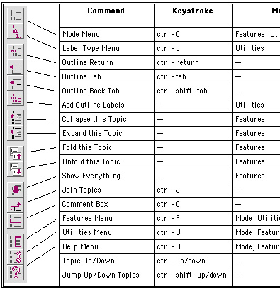
The most-used commands are on a handy toolbar plus pop-ups for all the rest. Every command has pop-up help, not just a little label. All commands can have keystrokes assigned and reassigned. It supports folding, has a robust internal scripting language, and is highly AppleScriptable. It supports all sorts of media, including speech. About the only notable things it doesn’t have are hoist, columns-in-the-outline, and corporate support.
WordPerfect Outliner Toolbar
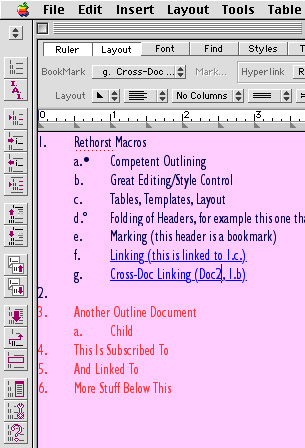
The screenshot below shows a few of the assets of this outliner. It has a collapsed header (marked by the dot), a folded one (noted by the little square), a marked one, a linked one, and an imported-by-reference secondary outliner. If you are used to working in a word processing environment, this could be the most writer-friendly outliner available.
Still.
WordPerfect Outline
The Feature Score-card
WordPerfect has: great outline manipulation commands; extreme internal and external scriptability and macros; named style options that make Word’s seem clunky; annotative comments; clones of any element; hyperlinks, including across documents; superb multimedia (and table and drawing) support; folding; multilevels in the sense that outlines can be nested by subscription; markers/tags (as bookmarks) that can be “gathered;” index markers; and—most notably—it is embedded in a macro-capable integrated word processing environment that is impressive even by today’s standards.
WordPerfect doesn’t have: high flexibility in numbering/label/bullet styles, including header relationships; hoist; columns in the outline; Finder outline integration (though you can build your own hyperlinked Finder table of contents); snipping management; alternative views; events; and standards-based export in the sense of XML/OPML (but it does support the Claris translators to Word and is one of the frequently-included import formats).
Availability
Corel’s free download site doesn’t work anymore. There are two alternative download sites known to me: a Web site and an unrelated FTP site. When installing, it seems you must be booted in OS 9. It will ask for a serial number, which you should leave blank. There is also a helpful, active mailing list. The application runs fine in Classic. If you just want to see a short list of features and picture of the outlining “button bar,” download the document “Enhanced WordPerfect Outlining 1.01” from MIT.
This is a double gift: we have John Rethorst to thank for writing these rather amazing macros, and Corel for updating and giving this little gem away.
What to Do
I’ve used all of these and each delivers its own joy. Play with them a bit and you may be able to find your own particular outliner among them, depending on your needs, work style, and imagination. Working on this column refamiliarized me with these gems, every one. As a result, I have shifted some of my outlining tasks back to one of them.
You may also want to keep some of these features in mind when interacting with the developers of your favorite OS X outliner—there is no reason why we can’t have outliners as good as we once did, and better.
About 60 readers had direct input into this column, an amazing display of enthusiasm and unselfishness. With all that help, I can assure that mistakes are mine. If you see any, let me know and we’ll note the fixes.
This is the next-to-last of our originally planned overview columns. The last was planned as an exploration of features that can be found in Windows outliners that are lacking in Mac OS X, a tricky idea and possibly not so interesting. I remind readers to send suggestions for columns. Items on the requested list at present are:
- A survey of concept/mind mapping techniques and products (which involve outliners)
- The NoteBook/NoteTaker comparison
- Hog Bay Notebook, SkinkHunt Notes, and similar outliners compared
- Comparisons of snippet managers (like DevonThink)
- Options for designing workflows
- Windows outliners with features that Mac outliners don’t have
- Interviews with outlining mavens like Marc Barrot (activeRenderer), Mark Bernstein (Tinderbox), Marc Canter (WebOutliner), and Dave Winer (MORE and Radio Userland)
- In depth reviews of specific outliners, of course
- Accessibility issues
- Specific product and scenario how-tos
Department of Corrections, Apologies and Additions
We’ve become aware that DeltaGraph for OS X is now available. It has an internal slide show capability; attached to that is a rudimentary outliner that mimics the outline view in Keynote and PowerPoint. You can indent and collapse but not much more. You can only export the slide view of your outline and then only as a graphic. But I can see that this might satisfy some folks who might have DeltaGraph open all the time and need to make simple notes.
Alert readers have revealed more outliners previously unmentioned.
Notes and Alepin are outliners in the mold of Caboodle, Hog Bay Notebook, and SkinkHunt Notes. Both appear to be fine applications worthy of exploration in their category. As with Caboodle, Notes is free.
Hog Bay Notebook is a class act among its type of outliners. A new version extends its reach in interesting ways that are worth tracking. The new version 3 is now in beta. You can check it out by contacting the author at Hog Bay Software.
Also, the Palm outliner Shadow Plan has an OS X beta that you can check out for free. And there is yet another novel outliner in the works: the evolution of a new outliner Iron Lute is being covered on the developer’s weblog.
Also in This Series
- A Progress Report · February 2008
- Some Perspectives on the Worldwide Developers Conference · July 2007
- Writing Environments, Plus Two New Outliners · November 2006
- Examining New Business Models · September 2006
- Outlining Interface Futures · July 2006
- Outlining Workflows and ConceptDraw · May 2006
- Dossier and Outliner Web Interaction · March 2006
- Two New Outliners: Mori and iKnow & Manage · February 2006
- Styles Revisited, Video Features, and a Proposal · December 2005
- Complete Archive
Reader Comments (20)
Great installment as always. Regarding your request list, I vote for the first five bulleted items listed. I think the broad surveys and comparative reviews would be most useful to the most people before narrowing down to particular products and interviews which will take some time to finish. Workflow options for total information management and communication would be most useful regarding practical application of the various products. I hope you plan to combine the installments into an information management buyer's guide in the end. Just my 2 cents.
Thanks again and keep up the great work.
Jeff
It'd be fun discussing outline publishing the next time you visit NYC, both from webOutliner and activeRenderer experiences. Let me know when you're around.
Marc
I vote for the NoteBook/NoteTaker comparison. I've tried both. I keep going back and forth because they are both so similar but each has features I like that the other doesn't. I would really appreciate and in depth review/comparison of both of them to help me make my decision on which one to commit to.
Thanks,
Nick
Looking forward to future installments.
Daryl.
Thanks for the work on this project. I'm learning a lot. I vote for the snippet management angle. I don't know if that would have the most social efficacy or geek utility, but this hobbyist has been through several schemes. I was probably happiest with John Holder's software (maybe EZ Notes) because I could set a category and import the snippets from usenet, mailing lists, or the web. Now, overlapping and opposing systems depending on the source and the nature of archiving and retreival.
Or a bunch of breezy narratives on "intelligence spook labs."
Thanks again,
-Mark
Computer outlining is most useful when accomplished on screen, where the user can exploit the ability to manipulate of headings. Outlining on the Mac flowered because the Mac supplied ultra-sharp black and white monitors. PC monitors weren't as sharp, but they had color before the Mac, and color is useful on screen, but not useful when printing in monochrome. On screen editing back then was much faster than printing because that was when most of us had dot matrix printers. Printing out a document was a major hassle, both because printing was inherently slow and dot matrix printers often suffered from paper jams.
Then came laser printers, and suddenly editing on a 13-inch Mac screen was what we tried to avoid. It was nicer to have the pages before one, at 300 dpi.
Outlining is once again flowering. What's new? Large, bright, sharp lcd screens. Now you can not only have the manipulation of headings that outlines afford on screen, but you can actually see more of the document at once there than on printed page. And we may differ here, but I see more development of outlining today on the PC than the Mac, because the prototypical Mac is the 15-17-inch imac, where the 19-inch screen is becoming the norm on the pc.
Demo at http://www.write-brain.com/
I've toyed with it on and off for a long time, but this article had me thinking hard about how to best organize my long fiction, and I've been drawn back to it.
Yes, we mentioned PowerStructure in our second column.
But we failed to mention that collection of functionality in our "Use Patterns" column.
We'll get back to these kinds of outliners in the future. They are a pretty fascinating group.
Best, Ted
I write to note that the new version of HBN is out but works only on OS X.3x. Users of older versions of OS X are left with the older versions of HBN. I understand that the author of HBN wants to phase out support for the previous versions but starting when and over how long a time I don't know.
Also, I was able to order Arrange as you were and it is quite a product! Look forward to learning it in more depth when the time presents. It seems quite powerful - what a shame it's not with us as an OS X application.
Best,
Stephen
http://tinyurl.com/2w6zd. In many ways it resembles the old MORE 3.1,
although the keyboard commands aren't quite as intuitive. I have started
using it, in preference to OmniOutliner and the Note outliners because it
can actually be used as a basic word processor. It is still in beta mode,
but the developer issues updates and adds features frequently. It shows a
lot of promise.
Am I the only one who remembers it?
www.inspiration.com
I sure wish someone would buy it, update it, and convince Apple to include it in their new OS versions!!! I just can't believe it has been left to languish!
Anyone else with ideas on how to convince someone to resurrect it?
Sharon
Lima, Peru
Thx for help
Thanks again,
-Bob
http://www.fluteplayer.net/2007/02/in-control-35-anything-like-it-online.html
Thank you for the kind words on FW and the later InfoDepot. Your generous descriptions warm my heart as much as the comments about it being a sad story also saddened me. I never thought of it that way, though I've always felt badly for our customers that the product was shelved. But by that time, the decisions were, as you noted, being made by others.
I never knew that there were serious efforts made to purchase the source. I had an idea that the eventual owner wouldn't sell, for reasons I probably can't get into, but I do know the source was properly archived and exists today, even if it's covered in virtual dust from disuse.
Thanks for the trip down memory lane. Let me know if there are ever any gaps in the history that might benefit from being filled in.
Add A Comment