About This Particular Outliner
Outlining Interface Futures
This month’s column deals with a rarely visited nature of outlining, focusing on some philosophy behind outlining and some user interface issues. We won’t highlight a specific example application as we often do.
We still owe you the finish of the ConceptDraw Suite column, started last column. But alas, we were forbidden from using the insightful real examples we worked up, so there will be a delay while I make up an example to substitute. Meanwhile, a new version of ConceptDraw has been released.
The Motivation For Revisiting Structure
What we will tackle this month has to do with just what outlining can accomplish. It is prompted by several recent things that came my way.
The first one of these was BareBones Software’s introduction of a new snippet manager, Yojimbo. You can read a good review of it in last month’s ATPM. It competes with a few established applications that are tuned to snippet collection and management. Plus, there are quite a few of our power outliners that can incidentally do a good enough job of this for most folks.
Most of these employ the outlining paradigm, because, well, because it makes sense as a way of organizing huge amounts of information. In a way, these things do what the Finder would if it were better designed, so it isn’t surprising that many use hierarchies with icons that look like folders.
Yojimbo collects all its stuff in a few “folders” that it calls collections. Hierarchy is not allowed. When it was first announced, the Yojimbo mailing list was ablaze with requests for nested collections (and other things). Bare Bones made a strong case for never having nested organization. (You can read the thread yourself.) Soon, enough influential users were hailing the “new” clean paradigm and eschewing outlines.
Now, these are smart guys that make good software. What they’ve done, I think, is hitch their wagon to a “new” notion of information tagging and retrieval that we’ll see come into more visibility with the use of “extended attributes” in Leopard. Other file systems are beginning to use these, and the idea of having standard ontologies from the semantic Web means that you should be able to tag and find things easily. “Ontology” in this context means a standard vocabulary of terms and the relationships among them.
It’s all connected to Steve Jobs’ statement that the Finder is obsolete, meaning that hierarchical organization systems are obsolete. As with any such trend, advancing the new unnecessarily means discarding the “old.” Something to think about here at the ATPO, the church of hierarchies and structure.
Another event is the rather slow evolution of the outliners.org wiki, which is intended to serve as a community playground for those interested in these things: techniques, applications, futures. No, I have nothing to report on the progress of the wiki, as it is in the hands of a few busy readers. But I have been thinking about a section of the wiki that is dedicated to exploring and perhaps suggesting futures for outliners. There’s a short list of features and directions that come up every time. But what about the cool new ideas that aren’t so immediately obvious?
So I’ve been thinking about ontologies and structure. It’s what I do for a living, too.
And the third event that motivates this column is Mori. Regular readers know that I shift around among power outliners. Call it a personality defect. Now it is Mori’s turn to be heavily used at ATPO headquarters. Heavily.
Mori’s developer, Hog Bay Software, has decided to go with a business model that is refreshing and a bit amazing. I bear no ill will to any developer, and all sorts are involved in the ATPO community. Every one I have encountered is worth knowing. Truly. But it is a bit maddening to be on the receiving end of a product development pipe and just getting what comes down, take it or leave it. In many cases, there is no warning at all that something is even in the works or that developer resources are applied.
The alternative seems to be open source, where if you so choose, you join a distributed team of mostly volunteers. You want a feature? Go out and program it. You think that conflicts with a competing philosophy of another contributor? Lobby your guts out on e-mail lists to try to convince others. I’ve tried it, and it frustrates. Questions of deep design often get watered down or avoided in open source.
I’d rather have a third way, where I pay someone to program and to bring some sort of coherent philosophy to the thing. But I get to advise. He consults me and takes me seriously. If something is hard or has a high cost, he lets me know and tells me what and why.
This is what Hog Bay is trying. It literally has a voting system where you enter your feature request, and the ones with the highest votes get implemented first. It goes so far as to report sales and Web site hits! This is more open than open software to me. Much of the source code is open, and Hog Bay encourages plug-ins. There have already been some impressive ones.
Well, you can imagine my dilemma. Here I am, a guy with ideas, and there sits someone asking. I’ve decided to put the more general of the notions from my ruminations here.
Assumptions
Outlining is familiar and natural. That’s one of its attractions. But if you think of it, it is natural because it is familiar. It is so familiar in fact that we sort of constrain what we expect.
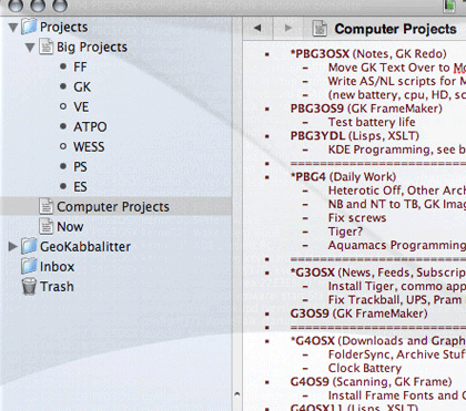
Let’s go back a bit. Apple popularized the desktop metaphor, which Microsoft and now everyone else copied. That metaphor is pretty simple: you have a high level space “on” which you have folders. Folders contain other folders and files. That’s the rudiment. The metaphor is simple, the notion of “in.” Things are “in” other things.
Real files on the disk aren’t in anything of course; this is just a way of organizing them. Now along comes the Finder’s outline view so you can see what is in what.
Paradigm number one: outlining shows what’s in what. That’s the first paradigm which leads to the first limiting expectation, that being “in” something is like physical enclosure.
Files and Documents
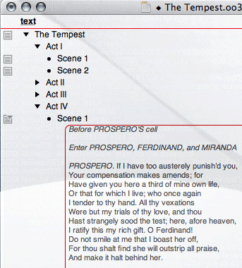
Our second of three existing paradigms is the document paradigm. We wrote about the history of this in an early column. It comes from structured documents where you have chapters and sections, and perhaps subsections then paragraphs. Some documents, like technical and military manuals, are heavily structured for obvious reasons including introducing change. An outline provides a high-level view of the document structure. So, for instance, you know in your car manual which chapter deals with the engine, and within that the fuel system, and so on down to the specific item of interest to you.
OK, so outline paradigm number two is that the outline shows finer detail. Or rather, the outline is a way of creating document structure, but in the user interface may function a lot like the paradigm above, where a desired paragraph can be found by looking “in” such and such section and subsection.
Structured Documents
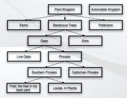
The third could be seen as a synthesis of the other two, but I prefer it otherwise. This comes from the database world. Its the old Aristotelian model of classification: plants, trees, deciduous trees, oaks, pinoaks, southern pinoaks, that southern pinoak in my back yard. This is a matter of what something is and how to define it. It’s different from the others, usually.
Outline paradigm number three is classification hierarchy. I won’t say much about this because it is fraught with technical arguments. Let’s just say that no matter what the limits and philosophical problems, it’s almost always the scheme of first resort when people organize things: lists and nests.
Tree-structured Data
Power outliners use all three of these, often with the same product but rarely for the same task or project. All three have a long legacy that goes way back before computers. The bad news is that these are so deeply rooted that we have a hard time escaping the assumptions that are behind them. Unless we have some clever thinking, we may be locked in these ruts forever. The longer we go without expanding, the deeper those ruts become and the harder to escape.
The interesting thing is that so many new products are appearing. They are amazingly varied and innovative, but not in the way they use outlining. No one anywhere is escaping the limits or expectations imposed by these three legacies.
Well, as the users that should be driving this community, we’ll fix that, right?
Other Organizational Tools
What else is there? Lets break it down into two categories because outlining lives in two worlds. One world is the logical world. If something is the child of something else, that childness is a relation or attribute. But outlining is one of the few assignment conventions that also lives in the user interface world, where you can “see” the structure or relationship and browse in some way.
Logical tools can easily be described by reference to language, because in a way language is the representation we most commonly use when working with meaning. So, roughly, if you can identify something, describe its characteristics, its state (a complex one, that one), and how it relates to or changes other things, there’ll be a common logical convention that can readily be used.
It’s the user interface equivalents that are more limiting. We have a very few ways of displaying information. Let’s count written language in here and equations. Both are fairly graphical, using visual means of different sorts. But they’re pre-computer.
What we have is tables (including lists and columns), labels, annotative tags, styles, networks, and diagrams.
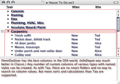
OmniOutliner, TAO, and Mori employ the user-defined columns paradigm, though not as thoroughly, to appear as an actual table or spreadsheet.

Tao’s Columns
OmniOutliner’s Columns
Almost all the products uses labels, following the notion of the Finder that a visual object has a color assigned. Sometimes these can be more than a short list and have user-specified names and colors. But only one such label per item is allowed. We’d need a new manner of visually displaying for more than one.
But labels can be seen as one graphical convention for a larger class of annotative tags. Products struggle with this, attaching keywords, categories, checkboxes, icons, and badges. Sometimes these have their own columns. All of these are logically the same.

“Tag” Columns in NoteBook
None of the products uses styles as metadata except a few that allow text highlighting to be a searchable and somewhat user-definable attribute.
Networks and diagrams are a tough one. There are a number of formally-defined modeling methods, and these can capture meaning well—many of them—to do useful work. But for general purpose use we end up with mindmaps and free-form diagrams.
Yojimbo and Leopard’s Finder will probably use labels and columns.
The bottom line is that we have tons of logical tools to annotate and characterize things and few graphical conventions to display them in a way other than simply: colors, icons, keywords.
Oh. And then there’s outlining.
Swallowing the Whale?
I put you through that survey—somewhat boring, I know—so that I could suggest that we start thinking about a next generation of outliners, ones that perhaps escape the restrictive usage we currently have. The downside is that the natural familiarity will be lost for some time while users accept the broader reach.
Here’s the simplest idea, one I’d like to see immediately. Smart folders are a good idea. They extend the outlining idea in pretty radical ways. Few outliners at present have them—Mori, Tinderbox, Dossier—but I expect many to do so soon. The ones that do collect notes do so without regard to the hierarchy in which they rest.
Clones are a related matter. Tinderbox only allows you to clone a note and place it somewhere. Its children don’t go along with it. Mori’s clones do carry their children, but clones and what ends up in smart folders are two different things.
What I’d like to see is smart folders that can find any combination of things based on any logical criteria and any metadata. We’ll leave out for now two interesting elements of this: alternative logics and how notes might inherit metadata by links to objects outside the outline. For now, let’s suppose that we really can have smart folders that find notes, make clones, and carry those clones and all the children of the clones. (Obviously, you’d want to sort out double entries where both a parent and child are found.)
No product does this now. Set it aside for a moment.
Now let’s suppose that instead of the smart folder being passive, it were active. Here’s an example: search for all the notes with a red label. Now you have a smart folder with clones of all the notes. That’s passive. If it were active, I could drag a note to it that had an orange label and its label would change to red and an alias be added to the smart folder.
If I had two smart folders, one each for orange and red labeled stuff, then dragging an aliased note from one to the other would have a predictable effect.
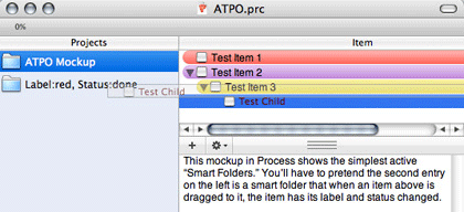
Mockup of Simple Active Headers
Now suppose that we weren’t dealing with simple labels, but with more complex attributes. The outline would be a way of creating content, dealing with structure of that content, defining metadata for that content, and displaying and assigning that metadata. All this.
Suppose you wanted to escape the limits of the simple attributes that Leopard will use (and that are already more capable than anything used in any ATPO power outliner), and you wanted to go with words that changed meaning depending on context.
Now I ask you to recall smart folders with hierarchy.
A trivial example might be in building a task list and assigning an attribute to to a task to trash the note when certain conditions are met. So it is tagged conditionally. If it finds itself collected by an agent that satisfies those conditions (like all the dependent and linked notes are ready for publication), then its state changes. Tinderbox can do this now in simple cases. But what if it’s not the state of linked notes you need to track, but the larger context of some derivative in the outline?
You’d need an inheritance hierarchy to show that, right?
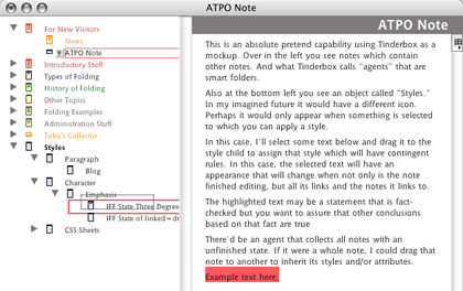
Mockup of Active Headers
Now we are getting to the point that instead of simple keywords we can have conditional states and complex semantics assigned to a note, or a family or any group of notes.
Hey, suppose you want to work inside the note and assign attributes to a text block like we suggested in a prior column? Cascading styles? Defined in an outline. Assigning them? As simple as dragging a text block to the stylesheet parent and dropping it on the appropriate child.
Scripts? The same. In fact, combining styles and style sheets in this way is a natural. Whether we like it or not, XML is what we need for portability and longevity. And XML, my friends, is a specification for nesting assignments, like the ones we’ve been talking about.
Maybe with all the new types of outline objects, you’d want columns of outlines with some indicator of function, like we impishly suggested in a fictitious April Fools column.
And that’s stuff that is probably doable now. Now. What you lose is the absolutely foolproof simplicity that outliners have now. That’s not to be tossed away lightly. But what you get is something that could be useful to Yojimbo, or Mori, or its inevitable competitors, and probably something worthy of the outliners.org wiki page on suggestions for futures.
Leo, which isn’t very friendly to Mac users, can have aliases that carry children, and incidentally can have themselves as children. And any note can have Python code that executes, modifying the behavior of the outliner. It’s the only non-Mac outliner I know that can do something not yet found on the Mac.
Links
OK. So we’ve talked about two kinds of enrichment: logical things that can be said about other things, and an expanded sort of outlining structure of the second sort of those things that includes the first sort.
There’s a third method of enriching, structuring: links. Several outliners allow links from text blocks to notes, more or less in emulation of Web links. Some others allow links from text blocks or notes to text blocks or notes. Tinderbox allows the links to be “typed,” which in this context means named or labelled.
Even the simplest notion of links, in the right hands, can add a huge amount of structure. One might say that the parent-child relationship is a specific type of note-to-note link. Going further, if you just focused on text-block-to-note or note-to-note links, you could easily display and assign them using the drag to active smart folder strategy above. As new levels of the hierarchy sprung open, you could go arbitrarily deep in the link network, even setting rules like highlighting the links that follow higher ranked notes according to a search strategy, or even a Bayesian learning agent.
My point in all this:
If we relax our presumptions a bit, and see outlining as a powerful user interface convention, it can be used to satisfy all sorts of tagging, structuring, and enrichment assignment and browsing. And perhaps for many purposes and users, it may be a preferred choice.
There’s a lot of life in the outliner world yet, and we are just at the beginning of a new era in how we interrelate and comprehend our information.
The ATPO Tracker
MindBurn
All hail the Mac! It’s a constant theme of ATPO that the Mac is the place for outliner experiments because more clever and adventurous users seem to gravitate to the platform. So we can expect lots and lots of different twists on the outlining idea. Here’s one.
What we have is an outliner that seems like many others in how it handles notes. As an outliner, it is a modern one, using Core Data and many of the same user interface conventions as Mori. But as an outliner it isn’t in the power outlining class. Its claim for your attention is the ability to expose you to entries over and over according to a schedule.
The theory is that any note worth saving is worth remembering. Another theory is that repeated exposure to a note “burns” it into the memory. Both of these are provocative notions. I don’t believe them myself, but I’m probably in a minority based on the number of kids I see highlighting nearly all their textbooks. If you are inclined to believe these theories, take a look.
There’s a separate issue here that MindBurn raises. Picking an outline tool involves deciding what you think of your information and where you draw the boundaries of useful information packets.
Some of our power outliners think of notes as if they were discrete entities, files in a way. MindBurn surely does. DEVONthink is in this school as well, and in fact can share resources with the Finder.
Others consider the whole outline as the thing that has identity. Writer’s tools like Inspiration, TAO, or OmniOutliner (when used in this mode) are like this. It’s the whole thing, each note in context of the others and the structure of the elements, that matters. “Burning” one of the parts of this misses the point that it is part of a greater whole, and that whole might be what needs to be exposed.
Others like Mori, Tinderbox, NoteBook, or NoteTaker can go either way, though Tinderbox has a unique philosophy in this regard. Some of these products are more flexible in this matter than others, and the latitude on drawing fences around information elements is something you’ll want to consider.

MindBurn
Circus Ponies NoteBook
The by now venerable NoteBook has had a point upgrade to 2.1. It adds LinkBack support, discontiguous highlighting, and major improvements in its media frame support. Media frames are unique to NoteBook, I think. Now you can frame more things and better.
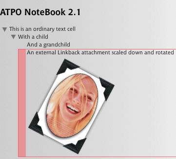
NoteBook’s Media Frames
Also in This Series
- A Progress Report · February 2008
- Some Perspectives on the Worldwide Developers Conference · July 2007
- Writing Environments, Plus Two New Outliners · November 2006
- Examining New Business Models · September 2006
- Outlining Interface Futures · July 2006
- Outlining Workflows and ConceptDraw · May 2006
- Dossier and Outliner Web Interaction · March 2006
- Two New Outliners: Mori and iKnow & Manage · February 2006
- Styles Revisited, Video Features, and a Proposal · December 2005
- Complete Archive
Reader Comments (12)
The concept of subsumption, containment, inheritance, IS-A, etc is fundamental to all the useful ontologies I know of. Sure there are other relationships, and, yes, subsumption can be inferred, but in practice it's a first order relationship.
The concept of nested folders, or outliner levels, particularly folders that allow multiple memberships (graphs) is a very useful way for humans to view and revise subsumption relationships. One of the things that drives me nuts about every full text search engine except Yahoo Desktop Search (X1) is they don't treat the parent folder string as a key search term. How stupid. OS X makes the same mistake (which is why I purchased an aftermarket spotlight extensions).
Subsumption is useful. Folder outlines are a good way to view this relationship. We need robust metadata and better ways to manage graphs, but we still need the folder metaphor.
If you want to take in a slightly different thought paradigm of user designed information organising, you really need to take a look at DabbleDB. It is totally amazing (you might even forget that it's a web application).
Fortunately for outlining, I think your interesting idea is quite wrong. It is all whole/part. General/detailed is whole/part applied to properties; whole/part is general/detailed applied to objects or entities conceived as objects.
Your comments on smart folders got me curious to know if you've encountered Smart Families in Journler and might have any thoughts on them.
John, re: Subsumption is useful. Folder outlines are a good way to view this relationship. We need robust metadata and better ways to manage graphs, but we still need the folder metaphor.
The main trouble I have with nested file/folder hierarchies is how rigidly they're enforced as the primary metaphor to organize and access content in situations where alternatives would be more effective.
That's often a drawback for me using DEVONthink Pro; its hierarchical document/group filesystem-like storage model makes it difficult to create other relationships between items in a database. It demands dependency on location when I want to make it irrelevant.
I'd prefer Yojimbo's iTunes-like Library storage model with playlist-like collections, but lack of optional hierarchical structure would become too restrictive. I've just started reading the Yojimbo "Hierarchical collections" thread Ted mentioned to see if that influences my perspective at all.
I'm a full text search addict. It's been transformational. At one point I got rid of every folder in outlook except "save" and "save older" (for technical reasons it was easier to split up my archives into past 6 months and 6 months to 10 years).
In the email/Outlook world there's a lot of rich metadata, so I could make do without folders, though recently I've recturned to creating temporary folders for active projects - folders don't really cause much trouble with full text search.
In the file system there's far less metadata (alas, I wish I'd had a chance to use BeOS), and containment relationships (name of containing folder) are invaluable, so I really need to treat containers as first rate metadat. I still create hierarchical structures with lots of "pointers" (shortcuts), I'm just more comfortable with shuffling them about.
With enough metadata one can deduce subsumption relationships. SNOMED, a medical ontology, does this using a Description Logic engine. In practice hand crafted hierarchy is still needed, I think it will always be helpful.
Constructed hierarchy will play a role too ...
How does this relate to outliners? I think the user defined hierarchy will always have a place (ok, pre-singularity anyway), even though acyclic and cyclic graphs are very useful too ...
If the summit of Mac outlining was More 3.1, the summit of DOS outlining was GrandView. My knowledge is second hand--I couldn't begin to use DOS--but confirmed by numerous trustworthy sources.
This, it seems to me, provides some very strong support for your theory that the level of the users drives the development of outlining applications. A small select group of early computer users created a temporary market for a product way ahead of anything produced today. Average level counts in this area, apparently, not raw numbers.
But the past peaks to which you look should for inspiration and guidance should not be limited by platform-chauvinism.
Tinderbox is at 3.5 (http://www.eastgate.com/Tinderbox/Tinderbox350.html). A point release for these guys is weighty stuff. There are too many new features to list here, but there will be at least one thing on that list that will blow you away.
Journler (http://journler.phildow.net/) has sort of come out of nowhere with some features no one else has: great iLife integration; Smart folders that inherit their parent's traits; two appearance views, one fullscreen and "low light" which reverses blacks and whites but keeps colors; and a toggle for note content views. Nice. $20 donationware, and shame on us if this guy doesn't get his due.
Opal (http://www.a-sharp.com/opal/) is the successor to Acta. You can download a beta now. Big deal for straight outlining.
Best, Ted
I write and edit books. Folders provide a marvelous place to "stuff" everything that goes into a book. It'd be a waste of my time to try to invent some elaborate schema that works as well as a folder for each book with subfolders for graphics and text. The very presence of something there reminds me that I need to use it. I even have a Junk folder so nothing really gets thrown away.
That said, smart folders are a good idea, particularly for time-based organization, i.e. so I can look at every file I was working on yesterday. But as a primary tool of organization--no way. Smart folders for content would force me to remember too much about how I organized something months ago, meaning coming up with long-forgotten words.
And doing keyword searches with Spotlight is a bit like many Google searches. There are so many hits, the results are almost worthless. All too often, I know in some vague sense there was another document I meant to include. But for the life of me I can't come up with any phrase that would locate the file for me. I need everything like that stuffed in one specific folder.
In short, files/folders are still best for major projects. Smart folders are handy for time or some easy-to-remember categorization scheme like red for urgent. Most of the time searches are only useful when you've found the file (or at least folder) you want and need to get to a specific place in it. Searching an entire hard drive that way is absurd.
Finally, if we're going to be attaching attributes and keywords to documents, Apple needs to make sure adding that sort of content much easier than it is now: saving, going to the Finder, finding the file, and using Get Info. One neat trick would be to give document windows a flip button, perhaps on the right away from the red light row. It would seem to flip the window over to a side where attributes could be set for each type of file and useful keywords added, as well as scratch notes for the user. That'd be much more intuitive than yet another menu selection. It's also more likely to be used and the eye candy would impress switchers.
--Mike Perry, Inkling Books, Seattle
I was intrigued with your positive comments about columns in an outliner and had to agree as alot of my data is in columnar format. So I tried out OmniOutliner, which I note figures again in this month's article. However after trying it there are some issues and I think columns in outliners still have a way to go in improvement. For example some issues are:
1. can't keep broadly similar data together, say carrying out research for a book about aircraft and need all the data in one file, but it some of ones data requires 6 columns, other data requires 2 columns and yet other data requiring 3 columns, one is forced to create a new file each time. Following on from that it requires multiple files to be search to find that data. Very time consuming when lots of files are involved.
2. still can't search the data on just one of the columns. I think this is a big draw back, given that one puts similar data into a column in the first place because it shares metadata with it.
So I was wondering what u consider is the benefits of columns in an outliner?
As one can just set a monospaced font and set up the data in columns in any outliner program.
Regards...Gordon
Add A Comment