Review: MarsEdit 1.0

Developer: Ranchero Software
Price: $25, $40 with NetNewsWire 2.0 beta, free with registered NetNewsWire 1.x
Requirements: Mac OS X 10.3, and an XML-RPC API-compatible weblog (Blogger, Blosxom, LiveJournal, Movable Type, Radio, TypePad, WordPress, etc.)
Trial: Fully featured (30 days)
Somehow, in the days immediately following the release of a public beta for NetNewsWire (ATPM review), Ranchero Software’s RSS reader (background here), I missed out on another part of the announcement.
In retrospect, it’s as if I left Steve Jobs’ 2001 Macworld New York keynote speech right before “Oh, and just one more thing….”
That just one more thing is MarsEdit, an editing application for weblogs, and a could-be iPod-like “just one more thing.” (In technical terms, MarsEdit is a Blogger XML-RPC API client.) Weblog editors are the answer to the question, “Do I really have to write posts in my Web browser?” They vary greatly in interface, from the now-defunct Userspace to Ecto, but all seem to share the same basic features: post to almost any weblog system with XML-RPC support, preview an entry, avoid writing HTML, upload files, and integrate with Web browsers and RSS readers, so you can easily blog an RSS item. I don’t want to get ahead of myself, but so far, MarsEdit is the best of the breed—all two clients that are still under development. I’m an ex-Userspace user, and I’ve become a convert.
Brent Simmons, who is exactly half of Ranchero, recently laid out what he did when he started writing MarsEdit. (For one thing, it was originally intended to be an outliner.) NetNewsWire 1.x has a weblog editor built in, and it was always a bit feature-anemic, so I stuck with Userspace for a long time. But when he decided that he wanted to split out the weblog editor, he settled on a document-based application made to look like an e-mail client. That’s MarsEdit’s schtick.
A brief historical diversion, if you will: going all the way back to LiveJournal clients, weblog editing clients have tended to be non-document-based, until quite recently. I used the original Windows LiveJournal client, which was modal way back when, and there weren’t a lot of alternatives. Sure, if you had a Radio blog, you had a document-based application—but the huge proliferation of blogs, as Maciej Ceglowski demonstrated in the NITLE Weblog Census, means that most people use Movable Type (about 44,000) or the big hosted services, BlogSpot and LiveJournal (707,690), all of which now support some form of remote posting. Between Ecto and MarsEdit, though, the future is clearly in document-based weblog editing.
So, yes, I know, I panned PulpFiction last month for relying too heavily on an e-mail metaphor. But I’ve been persuaded that Brent is correct here. E-mail is, after all, one of two major document models; the other is word processing documents. But, of course, word processing doesn’t ordinarily include titles independent of file names or writing in markup. Resorting to an e-mail model, additionally, means that you can easily access multiple past entries and drafts, each in its own window.
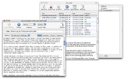
That’s precisely what MarsEdit does. The main window lists entries, in four columns, by default: title, weblog, date, and category. In addition, MarsEdit is built for multiple weblogs: the Weblogs drawer serves double duty for account preferences management and as a folder for entries. (A brief caveat: I only have a Movable Type weblog, so I don’t know if other platforms show up this way.)
You edit an entry, in an e-mail-like window, with a large text field, a Title field, a configurable toolbar, and a secondary button bar with a pop-up menu to select a weblog, and a (confusing) set of tabs for Body, Extended, Excerpt, and Keywords. A side drawer stores weblog-specific options, like Movable Type categories and comments options. A preview window is separate, and in the Preferences dialog it’s possible to enable live previewing, though for technical reasons it’s quite slow.

MarsEdit’s main window and a weblog entry open.
Nevertheless, I do have a few complaints. One of the peculiarities of editing in MarsEdit is that although the HTML Tags menu on the toolbar offers HTML tags and you can add custom tags in a separate Custom Tags menu, it is not easy (or obvious) how to add tags for non-HTML markup systems. If, like me, you use Markdown or Textile, you will have to custom-configure your tags. There’s no link editor that doesn’t insert an <A> tag, so a quickie shortcut I’m used to, the link editor, is useless if you use non-HTML markup. Setting the HTML or markup for the tag menu was always a preference in Userspace, and I wouldn’t mind seeing it come to MarsEdit, especially since Userspace let you set keyboard shortcuts as well.
To add some confusion to the complexity, keyboard shortcuts for tags only work if the HTML Tags (or Custom Tags) menu is on your toolbar. I see no obvious explanation for this except that there are no menu bar formatting options. Right out of the box, the HTML Tags and Custom Tags menus will be on your toolbar—but if, like me, you remove toolbar items you don’t see a use for, your keyboard shortcuts will stop working until reinstated.

MarsEdit’s editing window’s confusing toolbar.
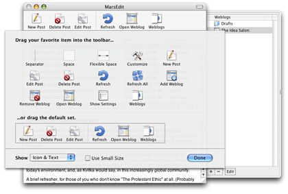
Since MarsEdit is designed to act like Mail, it looks like Mail, too, just adapted to weblogs. The toolbar buttons are all different, magnificent Bryan Bell creations along with the application icon. Like all of his work, they’re super-clean and fit in nicely with the overall feel and concept.
In fact, this is one of the application’s greatest strengths. I’m no expert on iconography, though I play one on TV, but all the icons seem immediately recognizable for what they are. That’s a formidable challenge with a weblog editor, since it doesn’t have any real-life analogues, and piggy-backing off of Mail could be confusing. I am especially fond of the way the “… Weblog” command icons look: an action symbol superimposed on a Safari-esque window. And the “… Post” command icons use a sheet of paper with action symbols. It’s a very clean way of saying a lot with a little, and they make an abstract concept much more approachable.

MarsEdit’s set of very attractive icons.
This is not to say that you will necessarily find an XML-RPC client that useful. After all, it’s not like an e-mail client; your weblog platform should have an in-browser editing interface, and not every platform supports external editing clients to begin with.
But if you’ve ever thought it would be nice to write a weblog entry while you’re not connected to the Internet, or to be able to easily spell check and copy edit them before posting, you should give MarsEdit a whirl. I’m a believer.
Reader Comments (2)
I love what you said about Bryan Bell's icons. He does great work, and I consider myself lucky to have the chance to work with him.
This review convinced me, and, I think, for all the right reasons. (It also helps that MarsEdit has an easier way to work with MarkDown.)
Add A Comment