Software Review
Curio 2.4

Developer: Zengobi, Inc.
Price: $39 (basic); $79 (home edition); $129 (professional); $65 (educational)
Requirements: Mac OS X 10.3
Trial: Fully-featured (15 days)
Graphic designers do a lot of their work in the fishbowl of their heads. Web pages, Photoshop images, and client requests swim around in the mental murk, waiting to be hooked and weighed. As their goal, Curio’s programmers quote a graphic designer who said, “I want this”: a single notebook to hold everything related to his project, laid out as he desired, while tracking sources and interconnections.
Curio provides a whiteboard metaphor (the “idea space”) to assemble a project’s pieces and keep it from falling apart before it gets started. Add images, text, URLs, or movies and arrange them as the mood takes you. Freehand painting tools and unlimited idea spaces help you develop each idea from nascent to fully formed. Do Web research within your documents and export your final project to a variety of formats.
Installation and Tutorial
Install Curio by opening its package (Curio240Home.dmg) and follow the simple instructions. Your Documents folder now has a tutorial Curio document called “Feature Tour.” It’s a fairly thorough review of the features, though it doesn’t solve the problem of what to do with a blank page. (The creative part–filling up the white space with ideas–is still up to you.)
Basic Functions
Curio reminds me of OpenDoc, Apple’s early 90s all-in-one document format. It supports display and playback for a number of text and media formats, just by dragging them into an idea space. (Each item you add to the project is called an “asset.”)

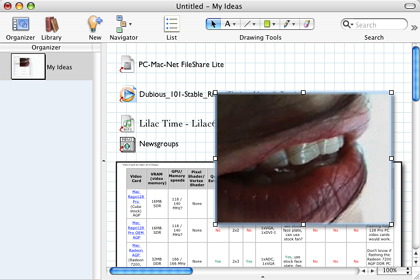
An idea space with several media files and documents.
The Library, a collection of all project assets, automatically tracks each item you add and will play back many media formats within the idea space. You can compile information for a DVD, for example, watching selected pieces of the video track to inspire layout ideas.
Professional and K-12 edition users also have the “dossier,” a set of questions that helps define project bounds and goals. These questions focus your design efforts, since each project element should serve a concrete need or task.
Many functions have single-key shortcuts, like Photoshop and other complex design applications. Hold Q to zoom out to show the whole idea space–move the mouse over a specific spot and release Q to jump there.

Zooming out to see the whole idea space.
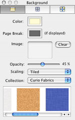
The backtick key (`) shows the inspector, a style window for the idea space background and any assets.

Pick colors and styles in the inspector window.
Document Templates and Graph Paper
Back in high school, design projects inevitably started with graph paper. Maps, math homework, and game designs all sprouted from neat grids of boxes. My relatives even received a thank you note or two written on my drafting pad. Hundreds of little green boxes initiated organization in a way the completely blank page didn’t.
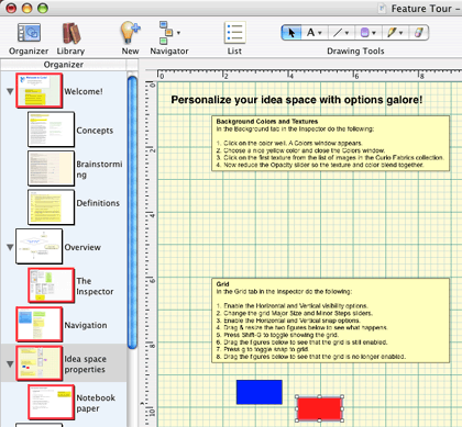
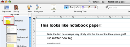
Curio includes several note pad templates that bring back the joy of graph paper, lined notebooks, and legal pads. This is a great feature, given its design focus. Set your idea space to graph paper by showing the inspector, choosing grid, and selecting a “Quadrille” or “Engineering” style. Pick “Edge Snap” from the “Arrange” menu and everything locks to the new grid. The same holds true with “notebook” style, your typical notepad.

Searching With Sleuth (Pro, K-12, and Home Editions)
Curio’s search engine, dubbed “Sleuth,” is a convenient way of searching many online resources without leaving the application. Sleuth culls results from several search engines and reference sites like Merriam-Webster and Encyclopedia Brittanica. Just knowing how many resources it has is helpful–dragging results directly onto the idea space is an extra-big win. Dragged items remember where they came from, should you need to reference their source later.
Finding items within your idea space is even easier. Type your text into the search box and Curio automatically dims any assets or idea spaces that don’t include that text. That sure beats checking your handwritten notes from the last two weeks, page by page!
Developing a Project
To the “why Curio?” question, they answer “because no other product can do all the things that Curio can do to encourage your creativity.” Practically speaking, this means keeping track of your ideas and resources without being overwhelmed by clutter. You can break concepts into as many idea spaces as you need without losing their overall integrity.
Since their demo is full-featured for two weeks, it’s easy to run through the examples for yourself, but the basic ideas are straighforward. Identify a few questions you need answered in a dossier (or on a blank page if you’re using the Basic or Home editions). Do some Sleuth searching to find related pictures and Web pages. Create a flow chart or outline to connect the answers to your questions and then work each idea into a specific design. Use jump points (similar to Web hyperlinks) to connect related ideas within your idea spaces.
Ultimately, you’ll still spend time staring off into space and listening to your mental gears churn, but hopefully less often, or at least more productively.
Best Features
I found searching for information with Sleuth Curio’s most distinctive feature. While the same information is available through a Web browser, its integration feels more natural to the design process. Even saving those few keystrokes keeps your mind closer to the project, where distraction can remove you from a promising line of thought.
Each function of Curio is possible with other design and media programs, but the common interface creates value not seen in basic software collections like Microsoft Office and AppleWorks. It also handles files from design tools like Photoshop pretty easily, managing them within an idea space rather than in an external folder. Curio also exports to TIFF, PDF, and even .Mac accounts.
Potential Improvements
While Curio is powerful, some basic elements of paper-and-pen design remain elusive. You’ll need a tablet for quality freehand design–mouse users will be better served with the object pallette. The tactile response of handwork remains hard to duplicate, if through no fault of Curio, since it includes pressure-sensitive drawing tools.
Originally, Microsoft targeted Excel to a particular kind of professional user, but eventually everyone found a use for its database-like listing and worksheet features. Curio seeks to satisfy graphic designers, but I suspect the combined toolset could serve a much larger audience if it was more accessible. Ironically, it might achieve this by “hiding” some layers of its functionality or including project templates on a more basic level than dossiers and the exhaustive tutorial. Parent-friendly DVD projects and blog-style publishing options both come to mind as potential enhancements.
Summary
Curio packages the most pressing needs of designers attractively in one application. Organization, research, and visual layout tools are all easy to work with and don’t require switching to outside editors except for specialized work. Notepad-style templates keep you in a paper-and-pen frame of mind while letting your ideas interact with each other. Expanding their market beyond graphic designers is possible, but certainly not necessary. What Curio does, it does well.
Reader Comments (3)
Add A Comment