Web Accessibility
RapidWeaver: A Useful Tool in Need of Sharpening
There’s plenty of software out there for making Web sites. What this series of articles aims to do is explore whether popular tools are able to make pages that meet the basic standards for Web accessibility. Refer to the previous articles in this series (listed at the end of this article) for more background information.
This month I look at RapidWeaver (version 3.5 beta 3). I set out to create a simple one-page document with a little text, some headings, a list, a couple of links, and a photo.
The Process
I started up the demo version and created a new Styled Text page, pasting some prepared text into the Edit tab. I then dragged in a photo from Photo Booth, using the iMedia Browser. On selecting the photo and calling up the Media Inspector I was easily able to add alternate text.
To create a link, I selected the text, clicked the Link button, and entered an URL. It was easy to name the page by double-clicking on the “Untitled Page” item in the list of pages. It was also easy to correctly mark up headings (down to level 4) by making choices from the HTML subsection of the Format menu.
I could find no way to correctly mark up a list, except by choosing the page type called HTML Code. It was impossible for most pages.
The Results
When I examined the coding for the newly created page, I could see that the name I entered had been placed in the <title> portion of the <head>. This is an excellent start.
Pages are created using an XHTML Strict doctype. This is also an excellent feature. Although I chose the first “theme” in the list, I checked a few others at random, and all seemed to use the same doctype.
The theme file also included links to half a dozen stylesheets—for print, screen, handheld, and an external JavaScript file. External stylesheets are good for accessibility.
I was disappointed to find that my pasted text had been automatically marked up, not as paragraphs, with <p> tags, but with line breaks. It would be a sensible default for RapidWeaver to assume that pasted text is paragraphs and to mark it up with <p> tags.
Where I’d chosen a heading it was marked up with appropriate <h> tags. I attempted to change the font for a few words, and RapidWeaver very sensibly applied a <span> with an inline style. This is miles better than old-fashioned <font> tag soup.
Line Breaks vs. Paragraphs
We have to remember that the coding behind the scenes is crucial for those who don’t look at a Web page, but instead listen to it or read it by touch on a Braille display. While software such as JAWS is designed for blind users and has many sophisticated features, any Mac user can get a quick idea of how a page sounds by using her computer’s built-in software.
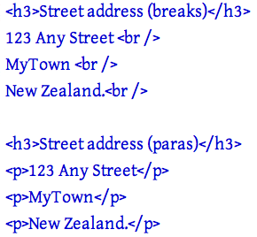
As an experiment, create a Web page with a couple of short lines of text. Add a break tag between them. Then duplicate the two lines, this time marking up them up with paragraph tags.

Web text marked up with break tags and paragraphs.
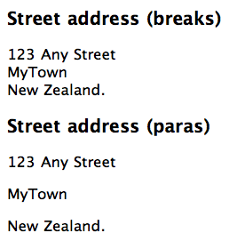
Now display the page in Safari, turn up your computer’s volume, select all the text and use the Speech submenu from Services to listen to the page.

What the browser displays.
You will clearly hear that the text separated only by break tags is spoken as one continuous item, while that marked up as paragraphs has a clear pause between each paragraph. Now imagine you’re a blind visitor listening to a whole breathless page broken only by line breaks, and lacking the clear delimiter of the paragraph tag.
We need to recognize that a line break is simply a way to achieve a visual effect, while the paragraph is the foundation of most pages. It should be usual for paragraph tags to be applied to otherwise unmarked text.
The Interface
Most people want some WYSIWYG software to make Web pages for them, which is why it’s so important that the tool help users rather than hinder them.
Of the software I’ve looked at so far (iWeb and Sandvox were the subjects of previous articles) RapidWeaver certainly does the best job, but it too has its oddities.
RapidWeaver gives the user three “Views” of her work:
- The Code view displays the HTML behind the page, but you can’t edit the code. It does however provide a checkbox to “Display tidied code” that will attempt to fix incorrect HTML and report errors. This is a very useful feature.
- The Edit view is where you paste or type text, make edits, select text, and apply formatting such as Heading 1, or Paragraph, and drag in images. In this view, text was marked with a green highlight when I applied formatting, links turned blue with an underline, and pictures were displayed, but it didn’t display as a Web page would.
- The Preview view displays what you can expect to see on your Web page, with the chosen theme applied, along with layout and any graphic elements included with the theme, such as lines and party balloons.
I found the Edit view confusing and unnecessary—why not just have Code and Preview views, available side-by-side and both editable? While irritating, that doesn’t affect the accessibility of output, but it does introduce clumsiness and confusion.
With RapidWeaver, each page has an underlying style, such as Styled Text, Movie Album, Photo Album. If you choose one of these styles there are some limited formatting options you can apply to text in the Edit tab.
HTML Code Page Style
There is one page style called HTML Code that allows you to add your own HTML code in the Edit view. In this page style, you can use any HTML code you need, easily applying markup from the Quick Insert pop-up menu or typing in the tags you need.
The Quick Insert menu does include the list code I wanted earlier, but not the all-important heading markup.
On HTML Code pages you can’t apply markup from the Format menu, where heading markup was available for other page styles.
Quirky
In all my years of making Web pages, I have perhaps once used the <strike> tag to apply the strikethrough style to text. I use heading and list tags many times per day.
RapidWeaver lets me easily apply the <strike> tag by placing it in prominent positions on two separate menus (the Format menu and the Quick Insert menu), but prevents me from easily applying headings if I’m using an HTML Code page and from applying lists if I’m using one of the other page styles.
This is downright odd—random, even—and suggests that the software’s creators don’t have a firm grasp on the principles of HTML.
Curious Omissions
Why does RapidWeaver provide a menu for headings only down to level 4, rather than all the way down to level 6? Even though levels 5 and 6 must be seldom applied, they are still a legitimate part of the HTML specification.
Similarly, although such old-fashioned formatting as Bold, Italic and Underline appear at the top of the menu, where they are easiest to reach and suggest themselves as desirable, there is simply no way on most pages to apply a list. If you need a list then you will have to use an HTML Code style of page.
On the other hand, in my test, applying Bold or Italic actually applies <strong> and <em> tags. This confusion of “strong” and bold afflicts many people.
Strong Is Not Bold
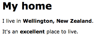
For black-and-white printed material we use bold type for at least three different functions. Bold can mark out a heading. It can also mark out distinctive text, such as a place name. Another function is to convey emphasis—the domain of the <strong> tag.

Three different uses for bold in black and white print: heading, distinctive text, emphasis.
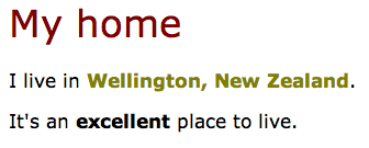
If we have more options for printed text, we may use color or some other characteristic instead of bold for headings and place names. And if we’re reading aloud, we don’t stress a heading or a place name, only words that require emphasis.
Screen reader software alters the voice to add emphasis when it encounters a <strong> tag. Do we really want visitors who listen to our pages to hear a sing-song rendition, emphasizing every book title or place name because we coded it as “strong” rather than “different”?

Using color for the heading and distinctive text, with bold for emphasis.
Because of all these different uses, “bold” has been abandoned as a useful tag for Web pages. What we need are tags that reflect the meaning of the text. Because “bold” can mean “heading,” “distinctive,” or “emphasized” it shouldn’t be given prominence in a menu, nor should it just apply “strong” in the background.
It would be far better if the menu label read Strong, so then you would know what you’re getting. And of course, the same applies to the Italic item that currently hides an <em> tag.
Place names and book titles should be marked up with a class with an appropriate name (such as “book” or “place”) and the stylesheet should then format that class. Only text which is truly to be emphasized should be marked up with a <strong> or <em> tag.
My Conclusions
RapidWeaver does quite well, as far as it goes. The interface is a little confused and confusing. The menu items offer an almost random assemblage of HTML coding: I can easily choose to strike through text or mark a subscript or superscript—all tags I have very very rarely used, while I cannot apply a list—something I use almost any time I create a page.
The coding behind the scenes is of a high standard, though not always entirely appropriate, and I can’t edit the HTML unless my page is of the HTML Code type.
Of the software I’ve explored so far, this is the best. It’s a useful tool for an ordinary person wanting to put together a good Web page, but it is somewhat clumsy and rather blunt.
While not entirely fostering accessible Web pages, it doesn’t hinder them either as some of the other software has done. On balance, it is on the positive side and could be a good starting point. If the creators were to sharpen up the software from a good grounding in Web standards and how to use HTML correctly, this is a product I could encourage others to use.
For the moment it’s a good start, and a better product than many.
Useful Links
- JAWS for Windows screen reader software.
- ScreenCastsOnline, free video tutorials for using RapidWeaver and its plug-ins.
- Quick Tips to Make Accessible Web Sites, Web Accessibility Initiative.
Related Articles
- Web Accessibility: Sandvox: Sand in the Eyes, ATPM 12.08, August 2006.
- Web Accessibility: The Clayton’s Web, ATPM 12.07, July 2006.
- Web Accessibility, ATPM 10.01, January 2004.
Also in This Series
- What Browsers Can Do, Part 2 · May 2007
- What Browsers Can Do · April 2007
- The Flip Side of the Coin · March 2007
- SeaMonkey 1.0.6 · December 2006
- PageSpinner 4.6.3: Quirky and Erratic · November 2006
- Nvu: Impressive and Powerful · October 2006
- RapidWeaver: A Useful Tool in Need of Sharpening · September 2006
- Sandvox: Sand in the Eyes · August 2006
- The Clayton’s Web · July 2006
- Complete Archive
Reader Comments (7)
JB
For example, if we make sure that lists of items are coded with the HTML list tags then the software that blind users have can let them know that it's a list, and gives them various controls over that list.
We commonly use lists in everyday life:
* shopping lists
* task lists
* lists of books we want to buy
* lists of DVDs we own
* ...
A list isn't just a 'bunch of paragraphs in a row', that's why I added the asterisks to my list in this comment. Why can't RapidWeaver let users make a list in one of the normal templates?
I think it's absolutely reasonable to ask software such as RapidWeaver to let ordinary users create a list, marked up with proper list tags, and not force them to become expert HTML coders to do that simple little thing.
Lists are just one example here. My point is that if the creators of the software understood that lists are important, they would be sure to include the controls for the average user. Strike is a legitimate tag and belongs in the application, but it must be used thousands of times *less* frequently than lists, even by ordinary folks. Why include strike and omit the list tags?
I am designing a new website and would very much like to find a community/website where web designers discuss accessibility. Are there any places where I can get sight challenged users to test my website?
However, I don't think it would be helpful for the novice user to replace the "bold" and "italic" menu items with their menu names. Most people aren't familiar with "strong" and "em" tags, and when confronted with those terms would be confused. Most people are more accustomed to the options in their word processors and expect other applications to be consistent with those experiences.
I love RapidWeaver, but my biggest irritation is the lag when entering custom code into the page inspector. Adding custom Javascript or CSS becomes incredibly frustrating when one has to wait for the file to save or "export" after every pause in typing, and then reclick into the text box to get going again. It seems like a small interface flaw, but it is a tremendous annoyance.
Add A Comment