GUI Junkie
Schemin’ and Themin’
In past GUI Junkie columns, we examined how to change the basics of the Macintosh graphical user interface—the icons of your drives, applications, and documents, and the desktop background. But what is a Mac user to do when that’s not enough? What happens when you want to change the entire appearance of your Macintosh, including the ways the windows and menu bar look?
The Rise of the Scheme
When Apple first introduced Mac OS 8, Macintosh users the world over were drawn to the new, redrawn windows and folders, and their 3D effects. Greg LandWeber, a math student and programmer, liked the new interface so much that he coded a special extension that users could drop in their 7.x System folders to get the OS 8 look. It was called Aaron, and is still available for anyone not running OS 8 or above.
Aaron proved to be immensely popular, and led to Greg’s development, with Arlo Rose, of what has become the premier way to change your Mac’s interface: Kaleidoscope.
We are used to seeing the typical Macintosh window and files look like this:
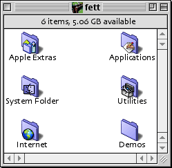 |
Not too shabby, especially when compared to that other popular operating system. Very clean, very elegant.
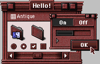
But what do you do when you want a totally different look? Say, something classical, yet stylish. Uppercrust, even. That’s the beauty of Kaleidoscope. Your Mac’s new look is only limited by your imagination-and that of the Kaleidoscope scheme designers.
As for that classical, stylish look?
 |
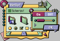
This Arlo Rose-designed scheme not wild enough for you? How about his Scherzo! scheme?
 |
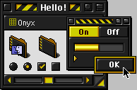
Perhaps you’re more of the dark and silent type? There’s a scheme for you too…
 |
Or one for the light and cheery…
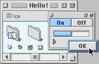 |
And these are just the schemes that come with the Kaleidoscope package! There are hundreds more available from the Kaleidoscope Scheme Archive. Below are a few examples.
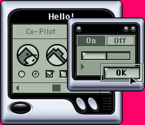
Like your Palm handheld so much, you want your desktop to follow suit? Then use Duncan Cowan’s Co-Pilot.
 |
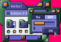
Or maybe you’d prefer the colorful stylings of Gedeon Maheux & Albie Wong’s collaboration, Echelon 8.5?
 |
Kaleidoscope is compatible with all versions of the Mac OS, from System 7 through Mac OS 9. If you are using Mac OS 8 and later, Kaleidoscope will take full advantage of the Appearance Manager, so any Appearance-savvy application will automatically use Kaleidoscope’s interface. Kaleidoscope also supports the new interface features introduced in Mac OS 8.5, including 32-bit icons, proportional scroll bars, window proxy icons, and sound.
And Apple Said, Let There Be Themes (Well, Maybe Not…)
During development of Mac OS 8, Apple officially declared the name of the standard Mac interface to be Platinum. One of the reasons for this was that Apple was experimenting with the concepts of themes for the Mac OS.
Themes are very similar to schemes, in that they change the overall appearance of the Mac interface. Unlike schemes, however, they do not require the use of a third-party utility like Kaleidoscope. Rather, themes are part of the Mac OS, and reside in the Themes folder inside the Appearance folder inside the Macintosh System Folder.
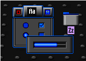
Apple beta-tested three themes for Mac OS 8—alongside the default Platinum, there were Hi-Tech:
 |
And Gizmo:
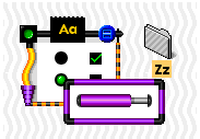 |
It was later learned that the third theme, Drawing Board, was tested only in Japan, though it found its way to other shores through the Internet.
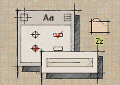 |
However, these themes never saw the light of day beyond beta testing, and have not been included in any version of the Mac OS ever released to the general public. (And no, I cannot provide you with these themes, so please don’t ask.) They live on in the Internet underground, but have led to the creation of new themes that you can simply drop into your System Folder and use.
A great place to start looking for new themes is the wonderful theme archive at Macthings.
Plays Well With Others
You can use both themes and schemes at the same time, but be aware that Kaleidoscope’s schemes will override whatever theme you currently have chosen. In some strange cases, where you have a non-Platinum theme selected, and a Kaleidoscope scheme that doesn’t quite change all of the system’s icons, you can end up with some unusual combinations of clashing GUIs. Fortunately, Kaleidoscope tends to play well with the third-party themes, as their creators generally use the original Platinum theme as a base for their designs.
Next month, we’ll explore in detail the operation of Kaleidoscope, and look at a step-by-step tutorial of changing themes within the Appearance control panel.
Also in This Series
- Schemin’ and Themin’ · August 2000
- Kill Your Desktop · May 2000
- The Icons, They Are A-Changin’ · April 2000
- Customization · March 2000
- Complete Archive
Reader Comments (4)
Instead, you have to go to:
http://www.macthings.net/
and click on "Themes Archive" in the "Interface" section on the top left. It will take you to the exact same page, but it will work this time.
Add A Comment